Please let me hear from you!

This blog is for sharing a love of paper crafting. You can also check out my Pintrest pages. If you find the ideas here to be helpful, I'd love to hear from you. It is what helps make the time I put into this blog feel worthwhile, and always brightens my day. I love hearing your ideas too!

(To leave a comment, scroll to the bottom of the post. You will see how many comments there are for that particular post. Click on the number of comments and the comment window will open. Also, if you want to add a link to something, follow the instructions at the bottom of this post.)

NOTE: If you click a link from the menu (below left) and are told the page does not exist, chances are good that it's a prepared post that will post at some point in the future, so be sure to check back!

You can also click this Pinterest Button to pin pictures in the blog posts.


Tuesday, April 30, 2013

Get Well Decorative Frames


This card again starts with a wax resist paper.  The purple glimmer and white glimmer frames started as rectangles, and had the insides cut out with a Decorative Labels Eight die. Before removing the dies, I ran them through the machine again to emboss the inside edges of the frames. 

The focal is a sentiment that was stamped and embossed with fine white powder after the purple glimmer piece was cut and embossed with the smallest of the die set.  When assembling, both the focal and the outer purple frame were added with foam tape.

Monday, April 29, 2013

More Decorative Labels Eight


This started with another wax resist paper I made.  The first thing I did for this card was to cut out the center of my patterned paper using the second largest die in the Decorative Labels Eight set. I cut a large piece of the purple glimmer paper using the largest die in the set.  

To make the focal, I used the third die to cut the white card stock piece.  While the die was still in place, I stamped the flowers - using a stamp from the Artful Collection from HOTP.  I stamped the sentiment, then added color with my water brush and the purple ink. I colored most deeply right around the inside edge of the die, then using more water I added a light bit of color in the area inside the die.  Next I sprayed with some silver Smooch Spritz before removing the die to reveal the white decorative edge.  

To put the card together, I simply layered the pieces I'd gathered.  First the outer edge of the patterned paper, then the purple glimmer, then the inside cut piece of the patterned paper.  Finally, I added the focal with foam tape.

Sunday, April 28, 2013

One More Card with Far East Stamps


This is another card made with the Far East stamp set (HOTP).  To me, it doesn't really have any Oriental flavor to it, despite the use of that stamp set.  The focal was stamped in black on a white piece of cardstock and then colored using my Aqua Painter and distress ink to match the patterned paper (Dusty Concord and Worn Lipstick).  When it was dry, I used a corner rounder punch on the corners and stamped the sentiment.

The patterned paper is another one I made with the wax resist technique described here. I framed my patterned paper piece with a glimmer paper frame I made by cutting the outside dimensions to fit the card with a narrow border, then cutting and embossing the inside of it with the largest of a new to me die set - Decorative Labels Eight (Spellbinders). I saved the inside die cut piece for another project.

Using the 2nd largest die in the same set, I cut and embossed another glimmer piece to serve as mat for my focal.  After gluing the focal to the mat, I attached it to the card with foam tape for added dimension.

Saturday, April 27, 2013

A Different Oriental Card


The patterned paper on this card is another waxed resist paper that I made as described here.  It's layered on top of a white embossed mat and then on the card itself.  

Using lighter colors like these with the Far East stamp set (HOTP) gives a very different look that that of the strong black/red/white/gold I used in recent cards (here, here, and here).  The lanterns are stamped with a stamp from the Far East set from HOTP.  They are colored using my Aqua Painter water brush and Worn Lipstick distress ink. The bottom edge is cut and embossed with a Spellbinders Edgeability die, and then colored in the same way.

The sentiment was stamped with distress ink on white cardstock and then cut with a Fancy Tags Die (Spellbinders).  Using the water brush, I stenciled more color around the die.  This was matted over a pink piece cut with a couple of dies from Octagon Strips and Accents. The white mat was made by tracing around the outside of the die and cutting on the tracing line.

Wednesday, April 24, 2013

Template Stenciling


This card is a little different.  It comes out of experiments using templates as stencils with dimensional paint.  I made this card for a challenge on the Paper Wishes Message Board, but had already started playing with the butterfly template this way before I saw the challenge.  

Templates/Stencils: The butterflies are from the HOTP template 15 Butterflies and Dragonflies, and the frame is a Crafter's Workshop template called 12 x 12 Fancy Frames.  I also used a metal stencil for the greeting - again with dimensional paint. The hardest part about this card was waiting long enough for the dimensional paint to dry.  Hitting it with a heat gun tends to cause extra warping and I didn't want that. 

Background: I started by using blue dimensional paint with the frame template directly on the front of the card.  After removing the stencil, I sprinkled white fun flock over it for some added texture.

Sentiment: The greeting started with a die-cut square (Spellbinder's Fleur de Lis Squares) of blue glimmer paper. The stencil I used was a heart-shaped one with this message inside it (made by Heritage Handcrafts).  I masked what I didn't want to use, then used white dimensional paint over the words.

Embellishments: The butterflies were also stenciled with white dimensional paint on blue glimmer paper.  After the paint dried, I fussy cut around them, leaving a narrow border of blue paper.  I folded the wings along the body and then made antennae from thin 34 gauge wire which I glued to the back.  I added black FlowerSoft to the center to form the body and attached them with double sided tape JUST along the body. 

Tuesday, April 23, 2013

Waxed Resist Sympathy Card


One of the things I find most amusing as I work to use up the wax resist papers I made, is that I love the leftover waxed paper pieces so much that I'm using them up first! Go figure! I'm SO glad I didn't just throw those out!  This card makes use of both. It also uses that lovely suede paper that comes from HOTP.  I LOVE the feel of that paper - and the way it can be cut and embossed with a die!

Waxed Paper Resist: I began by adhering the colored waxed paper to the colored cardstock of the same design. This REALLY gives depth to the design as the cardstock was colored with a different color than the waxed paper, and the waxed paper is translucent. I then used my dies to cut out the large square (Marvelous Squares) and the tag (Fancy Tags).  

Suede Paper: From dark green suede, I cut and embossed two pieces for the focal - the larger of the two was from Decorative Labels Twenty-seven, and the smaller from Marvelous Squares.  I then drew around the outside of the Fancy Tags die used for the sentiment and cut on that line - again out of the suede (I discovered that by pressing down on the die as I drew around it - even though I was drawing from the back - the front looked like it had been lightly embossed). I also cut several thin strips of this paper to use for borders.

White Paper: A large piece of white, embossed with one of my M-bossabilities folders, forms the background.  The large white frame was cut and embossed with the 2nd and 3rd largest dies from the Marvelous Squares set of dies, and the center mat for the focal was cut and embossed from one of the smaller ones in that same set.  For the sentiment, I traced the inside of the Fancy Tags die and cut around that.

Focal: After layering all my cut pieces, a few stickers from my stash complete the focal. Both white pieces are attached with foam tape for added dimension.

Sentiment:  The sentiment was stamped on the white piece of paper using black ink.  I wanted it to look more like the green suede, so I traced over top of it with a green pen.  Green ink by itself - at least the colors I have - would have been way too light and bright in color. Then I simply layered my pieces and attached them to the card. 

Borders: After attaching my suede borders to the card, I felt they needed just a touch more.  Using a leftover strip of suede paper, I first tried to tie a bow - but the paper tore as I tried to do that.  I WAS able to tie a loose knot, however, so that's what I used to make my "bow".

Monday, April 22, 2013

Spring Hello with Wax Paper Resist


A flowering tree is the highlight of this card.  IT was stamped in brown ink using HOTP Four Seasons stamp set. It was colored with gel pens and my Dove blending pen.  Diamond Amethyst Flower Soft adds an extra touch to those flowers.  The focal was stamped on a white piece of card cut with a Spellbinder's die - as was the sentiment.  

I love that littlest die from the Resplendent Rectangles set for greetings and labels! In this case, the greeting is matted on the same embossed glimmer paper that forms the borders on either side of the card. (Embossing done with an M-bossabilities folder from Spellbinders). 

The background papers are two that I made.  The purple is one of those made on glossy paper using wax resist and Dusty Concord distress ink (I talked about making them here).  The translucent paper in the center is one of the left over pieces of wax paper that I colored with alcohol ink - as discussed here.

Sunday, April 21, 2013

Oriental Mama


For my second oriental-style card, I started with this red background (another of my wax resist backgrounds shown here) - once again using my Far East stamp set that I got from HOTP. 

I started with the border.  I like the fact that this lantern stamp can be stamped end to end to create a longer border.  Once was too short for what I wanted; twice was too long. So I stamped twice and then cut it back to what I wanted.  I used red (Siren) and gold Smooch ink to color my lanterns and the ribbon holding them.  I also ran a bit of gold smooch along the lower edge (cut and embossed with a Spellbinders die).

The focal is cut and embossed with a die from my Marvelous Squares set (Spellbinders Majestic Elements). I then stamped the flowers twice - a full one on the right, and a partial one on the upper left. Whenever I see flowers like this, I think of light pink cherry blossoms, but I decided they would look okay in red to compliment this card.  I colored the flowers with Smooch and stamped the name (stamp made with my Teresa Collins Stampmaker).  I colored the border of the piece by dabbing my stylus onto my stamp pad and then rubbing it along the edges.  Doing this on my craft sheet made cleanup easy. 

The final step was to stamp the butterflies (from the same stamp set), color them in with smooch, fussy cut the edges, and mount with foam tape under their wings for dimension.

Saturday, April 20, 2013

Oriental Thank You


Continuing my use of backgrounds made with waxed paper resist, I turned to the ones made with this oriental style M-bossabilities folder (the one used here is shown in the lower left corner of the first picture there).  I really like the way this card turned out.  I took this background a bit farther than the simple wax resist. First, I sprayed the basic wax resist background with some of the "glimmer spray paint" that I had made here.  After it was thoroughly dry, I lined up the pattern with the M-bossabilities folder that I originally used and ran it through my Grand Caliber to emboss it.   

While it was pretty, the background looked a bit washed out.  I thought how nice it would be if the black was a glossy black like you see on lacquered oriental furniture.  Then I thought of embossing powder.  I took my embossing pad and ran it across the background so it inked the raised areas.  Then I sprinkled the whole thing with black embossing powder and melted it.  I loved the result!


The focal was stamped with a stamp from the HOTP Far East set and colored with Smooch ink.  I then cut it with a scalloped square Spelbinder's die.  The red and white mats were cut and embossed using the Marvelous Squares dies (also from Spellbinders). The focal itself is mounted with foam tape for dimension.

The sentiment was made in three pieces.  The red and white mats are cut with Spellbinder's dies - Octagon Strips and Accents, and Fancy Tags.  For the sentiment itself, I traced the inside of the Fancy Tag die onto white cardstock and cut that out.  I stamped the sentiment with a stamp from Tiny Words & Images (HOTP) and then inked the edge before mounting it with foam tape.

Friday, April 19, 2013

Emboss It, Stamp It, Pop It Up


Hot pink and teal - two of my favorite colors. This card began as a piece of left over embossed waxed paper. I covered it with Stream colored alcohol ink. I then stamped this birdhouse on it with black StazOn and embellished it with Smooch inks.  

I embossed a piece of white cardstock with the same embossing folder I used for the waxed paper and glued it to the front of the card.  Then I added a leftover pink glittered cardstock "frame" to frame the entire card. It wasn't quite the right size so I cut a small piece out of the center and lined up the edges - you can't even see it on the finished card.

I rounded the corners of the piece of waxed paper.  The piece was smaller than I really wanted it to be, so I cut it and separated it with a white embossed strip of paper that I slipped under the pink frame. 

The birdhouse didn't "pop" the way I wanted it to, so I stamped it again on glossy white cardstock and on the glittered cardstock. I cut out the house from the glittered cardstock and glued it to the glossy cardstock. I mounted it with dimensional tape on top of the previous one.  Then I colored it in with Smooch ink.

For the sentiment, I die cut a tag from the pink glittered cardstock.  Using the die, I traced the inner shape on a piece of white paper, cut it out, and stamped the sentiment.  At this point, the card looked like this:


I liked it, but it felt a bit off balance, so I decided to create the border you see on the finished card.  I cut a strip of the glittered cardstock and glued the black ribbon to it.  Then I die cut a tag. It was longer than I wanted, so I just chopped a piece out of the center, taped the ends together, and added it to the border. I cut a small piece of white for the center of this tag, then added the black bow.

Thursday, April 18, 2013

Make Your Own Sketch


I really enjoy spending time on Paper Wishes Message Board.  There are so many nice people there and so many fun ideas.  This card was made for a challenge on that board.  The challenge was to make your own sketch from a card you like.  For some reason, I've never thought to do that before!  I went through my pictures of my cards to find the layouts I liked the best and created quite a few sketches.  So, I suspect that in the future you may periodically see my sketches on this blog because of that challenge.  Here is the first:


I made this sketch based on the following card I made some time ago.  To find out more about how I made this original card, you can look here:


After making the sketch from this thank you card, I made the Mother's Day card from it - the one you see at the top of this post.  As you can see, I decided to put the focal on an angle this time and moved the bow to underneath the focal.  Here are a few notes about how I made the Mother's Day card:

  • Papers - The background is more of the leftover embossed waxed paper that I used for a waxed paper resist and then colored with alcohol ink after creating the resist. I LOVE the translucent look and am SO glad I didn't toss all those pieces of used waxed paper!  The remaining papers are from Paper Wishes - except for the plain white.
  • Die Cuts - I die cut and embossed elements of white paper using three different sets of dies, and the lighter patterned paper from a fourth - all from Spellbinders.  The main one that mats the focal is from Fair Isle Pendents; the center one on the border strip is from Octagon Strips and Accents; and the other two are from Splendid Circles.  The center focal piece is cut with a die from Marvelous Squares.
  • Focal - After die-cutting the focal piece, I added the greeting with dimensional paint and a metal stencil I got from Paper Wishes - a Paula Hallinan stencil. I had to do it in three parts - each word separately, let it dry, do another. I then matted it on white paper and cut close to the edge of the die-cut piece.
  • Ribbon - I used three different ribbons from my stash.  The first is the one I used on the border - a fun pink and multi-sparkle ribbon that I got from my mother - seems appropriate to use it on a card for her (unless you're reading my blog, Mom!  If so, let me know you saw this and I'll send this to my Mother-in-law and make something else for you that you DON'T see! :) )  The other two ribbons are a plain pink and a white with silver edges - probably purchased at Joanne's Craft store.

Wednesday, April 17, 2013

Stamping Resist

Here's another card from my wax paper resist series.  This one starts with a background made from glossy cardstock and wax paper resist.  Since I had used the Broken China Distress Ink for the resist pattern, I also used it to lightly ink the edges.  

The white mat for the focal & ribbon border was cut with a Spellbinder's die (A2 Fancy Ribbon Threader).  I threaded a piece of ribbon through it and wrapped it around to the back of the background cardstock.  I tied a knot in another piece of ribbon and glued it in place.

The patterned paper that mats the diamond-shaped focal is one of my pieces of leftover embossed waxed paper that I colored with alcohol ink.  I stamped it multiple times with one of the floral stamps from HOTP Artful Collection using StazOn ink.  The focal itself also uses a stamp from the Artful Collection.  I used an aqua gel pen to draw around the edge of the focal.  I also used it with my Dove Blender pen to color in the center of the "banner".

Tuesday, April 16, 2013

Oriental Flavored Card


Today's card is another that makes use of the leftover embossed and alcohol inked pieces I showed a couple of days ago.  Here I've used the golden one for the background.  The embossing is hard to see in the picture, but it's an oriental design and forms a great backdrop for the oriental focal. 

I wanted a narrow black frame for it. To make it, I started with a 5"x7" piece of black paper.  Then I looked through my dies to find one that would work to give me a narrow frame.  I found the length of the largest Fleur de Lis Rectangle die from Spellbinders fit the width of my paper piece perfectly. Of course, after cutting with the die, I still had quite a bit of the length of the paper piece that wasn't cut. I moved the die to the bottom of my paper piece, carefully moving the overlapping already cut section to the top of the die so it wouldn't get messed up. (I hope you understand what I mean here - wish I'd taken a picture!)  Running the paper/die through my machine again, gave me the black frame you see on the card.

The focal was made with a stamp from the HOTP Far East stamp set.  I stamped with embossing ink onto some red glimmer paper and then heat embossed it with fine black powder, then trimmed close to the embossing. The red frame was first cut with the largest Marvelous Squares die (Spellbinders) and then embossed with it AND the next largest die.  Then I used an embossing pen to color in some of the embossed sections, added black embossing powder, and heat embossed it before popping it up on foam tape.

The sentiment is a portion of a border stamp from HOTP Matching Borders and Focals stamp set, stamped on a piece cut with one of Spellbinder's Fancy Tags dies.  It is also attached with foam tape and mounted over a border of 3 black ribbons.

Monday, April 15, 2013

Thankful for Waxed Paper!


Here is my first card using the techniques I showed over the last couple of days.  The multi-green background is one of the leftover embossed waxed papers that I showed yesterday. Using brown StazOn and my new HOTP stamps set (Four Seasons), I stamped the focal image of the tree, piles of leaves, and a rake.  I had expected to color the leaves in, but found I liked them just the way they were.  

The frame is a brown glimmer paper.  It is actually the border of a lattice piece (Cheery Lynn die). I had cut out the inside lattice and used it for something and this was what remained.  It made a nice border for my alcohol-inked paper.  

The frame for the sentiment is the outside of the smallest die in the Resplendent Rectangles die set (Spellbinder's Majestic Elements). I trimmed the outside to a rectangular shape as you can see.  I stamped the sentiment on a white piece of paper and then popped the rectangular frame around it using foam tape.  At this point, the card looked like this:

To finish, I stamped a border of leaves top and bottom, then stamped a few more and cut them out to add a bit more interest to the framed sentiment (see picture at top).

Sunday, April 14, 2013

Wax Resist Leftovers

Yesterday I showed you the results of my wax paper resist experiments.  Today is a look at what I did with the leftovers.  After my papers were all colored so nicely, I was left with a bunch of embossed waxed paper - without much of the wax left.  I started to throw them out, but just couldn't!  They still looked so nice with their lovely embossed designs.  

So, I decided to cover them with alcohol ink, using the applicator with felt pieces.  Now I have a bunch of colorful translucent papers to use in my card making.  They sort of remind me of printed vellum or tissue paper.  Here are closeup pictures of a couple of them (the two on the left side of the picture above):

This fern-like emboss was colored with a mix of Willow, Lettuce and Clover. The Oriental design below is colored with Butterscotch and Gold Mixative.


In tomorrow's post, I'll start showing how some of the results of the last couple of day's experiments look when they're made up into cards.

Saturday, April 13, 2013

Embossed Waxed Paper Resist


I had some fun the other day playing with waxed paper, and you see the result in this picture - lots of fun colors and patterns.  

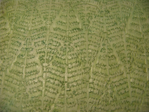
I cut my waxed paper to fit my embossing folders and ran them through my Grand Caliber. Here's a piece of embossed waxed paper (on a dark background so hopefully you can see it):


I cut white cardstock to the same size - twice as many pieces as I had waxed paper pieces.  Then I sandwiched the wax paper between two sheets of white cardstock and ironed it with a hot dry iron for a few seconds.  The wax came off onto the cardstock, creating a resist.  Then I added color - wiping it off the wax-resist area.  I used two different techniques:

First, I used glossy cardstock, sandwiching the waxed paper so that the glossy side of both were facing toward the waxed paper before ironing.  In other words, I had a glossy piece facing up, then the wax paper on top, then another glossy piece facing down - creating a cardstock-wax paper sandwich.

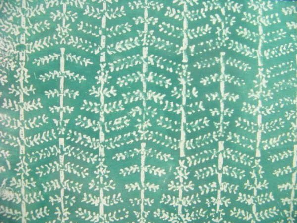
With the wax resist on my glossy cardstock, I colored them with distress inks - wiping the pad directly onto the cardstock, then wiping with a paper towel to clear the ink off the resist.  Some pieces were colored with just one color - this one was called "pine needles":


On others I combined several colors.  Here I used 3 colors - worn lipstick, broken china, and dusty concord:


Of course you can't see the shine very well, but in person, the gloss of the cardstock is certainly visible.

You never know how the pattern will turn out.  Sometimes the pattern is quite similar to the embossing folder - as with the green one above.  Others turn out quite differently.  The 3-color one above, for example, was made with a simple dotted embossing folder.

The second technique I used started with plain white cardstock - not glossy.  I ironed these as before, and then colored them with various ink sprays - wiping them with paper towels as before.  This one was done with Glimmer Mist:


Naturally, it's not easy to see the shimmer in the photo, but it's there in person.

This last one I'll show was sprayed with Walnut Ink:


It looks a bit shiny in the picture because of the way the light was hitting it, but in person you can see it is really not. 

Combine this technique with what I shared yesterday about making glimmer sprays, and I can make lots of fun patterned paper really inexpensively. What fun!

Friday, April 12, 2013

Glimmer Spray/Glimmer Paper - Make Your Own!

Here I go again - focusing on topics that are hard to see in pictures.  Today I'm looking at how to make your own glimmer spray and use it to make your own glimmer paper.  To make the spray, I just added water to some old  white pearlescent acrylic paint that I had on hand (and I mean old - I'm guessing I got it at least 10 years ago!).  I didn't measure it, but would guess I used somewhere between 1 and 1 1/2 teaspoons of the paint and then just added water until the bottle was 3/4 of the way full and shook it well to combine.  I'm guessing my spray bottle is a 2 ounce bottle. You probably want to be sure you have one with a lid to keep the sprayer from getting dried out.

It's nearly impossible for me to get a good picture of this effect, but the picture above shows a piece of blue cardstock without the spray paint and the one below has the paint on it.  In person, the color doesn't change much - it's a bit lighter in some spots if the paint gets sprayed really thick.  What you see, is simply a lovely misty-sparkle when the light hits it.  It really looks like glimmer paper!
I made the card using this technique.  To make the focal I:
  • Placed my die on the yellow cardstock and then stamped in blue ink (so the stamp wouldn't run into the decorative edge).  I stamped on a double-layer of fun foam, and pressed hard at the edges so I could be sure the die wouldn't interfere with stamping where I wanted the ink to be. 
  • Cut and embossed the piece with my Spellbinders die and my Grand Caliber machine.
  • Colored the flowers in with smooch ink and the dots in with a blue ink pen. 
  • Sprayed it with my home-made misty spray.  NOTE: In the future, I would not add ink pen until after spraying, because that ink ran (the Smooch was fine). 
  • Cut and embossed the blue mat shown above and sprayed it with my misty spray.
  • Popped the yellow piece up on foam tape.
The patterned paper was from the paper swap.  I matted it on blue cardstock (I didn't spray this one but I DID cut out the center of it to use somewhere else). I finished it off with an embossed strip border made of the blue cardstock.  After embossing, I sprayed it with my sparkle spray, then colored in some of the raised areas with Smooch ink and then finished it off with Liquid Pearls dots.

I love this spray and I've got several colors of leftover paint, so I need to find some spray bottles and make some more colors. I can't wait to play with them!

Thursday, April 11, 2013

More fun with flock!


Here's another card that's waiting for a sentiment - though I may just send it without as a simple "hello" card.  The light blue patterned paper is from the paper swap I've mentioned frequently in recent posts.  It is a "Shine Design" from HOTP.  I've been experimenting with embossing various patterned papers, so I ran this piece through an embossing folder.  I love the additional texture!

The focal was created in a similar way to what I showed yesterday - dimensional paint and flocking with a stencil.  In this case, I started with a piece of blue glimmer paper that I had cut and embossed with a Spellbinder's die.  I used blue paint for the bird and green for the rest of it.  After removing (and cleaning) the stencil, I added white fun flock.  I then decided to use a touch of red Stickles for the berries.  After it dried, I matted it on a piece of white glimmer paper that was cut and embossed with another Spellbinder's die from the same set. (This is one of my favorite die sets - Resplendent Rectangles - one of their Majestic Elements series).


Wednesday, April 10, 2013

Fun with Flock!

As you can see, I haven't yet added a sentiment to this card - I'll wait to see the occasion for which it's needed.  As it is, it can easily be used for get well, thinking of you, birthday, etc.  As you can probably tell, there's a little tag toward the bottom where I will put the sentiment when the time comes. 

The picture of this card is FAR from doing it justice. I just haven't figured out how to get good pictures when the paper is mostly glimmer paper.  Anyway, the background of this is a maroon glimmer paper that's been embossed with an M-Bossabilities folder from Spellbinders.  The focal and mats are cut with spellbinder's dies.  The mat is a peachy-pink delicately patterned paper that is really pretty in person - not sure who made it.  The tag for the sentiment is hooked through the patterned edge of this mat - it hasn't even been glued in place yet, but the "hooks" hold it where it goes. 

The focal on this is the fun part.  It uses a new-to-me technique that I recently saw on a TV show called "Scrapbook Soup".  Basically, you use dimensional paint with a stencil, carefully remove the stencil, then quickly sprinkle your image with flocking, tapping off the excess before letting it dry. (Make sure you clean your stencil right away - dimensional paint can be hard on them.) This gives such a fun effect and is really nice in person. You just HAVE to touch it! :-)

For this particular focal, I used several colors of dimensional paint on a black glimmer-paper background.  I did the stem and leaves in green, then put a touch of red in the center of the flower before adding white.  This gives a pinkish flower with shading that looks really nice in person.  I used white fun flock over all of it - stem, leaves, and flower. As you can see, the flock doesn't really change the color - just adds a fun furry texture. I can't wait to experiment with other colors.  I need more fun flock! :-)

Tuesday, April 9, 2013

Masculine Stamping


Today's card is another one I made with a masculine flavor.  I'm a bit frustrated with the picture - the colors aren't quite the same as the card. In person, you can see that on the original card, the blue matting is not as strong, and the purple stripes are more muted as well." 

As you can probably tell, the basic card was formed from three different papers: striped, green, yellow. I started by stamping the tree on the yellow patterned paper, using a green ink (masculine collage stamp set from HOTP). I then took a smaller embellishment from the same set and stamped it twice near the base of the tree for the illusion of grass. Next, I took a brown pen and drew an outline of the trunk and branches to make them stand out a bit more.  I used the same pen to draw around the edge of the background papers, making it look like there's a very narrow brown mat.

The leaf in the upper left corner is a semi-embossed metallic leaf from my stash - I think I cut it from a DCWV paper, but it was just a scrap in my stash, so I'm not certain.

The focal was a stamp from HOTP.  I stamped in brown ink on tan cardstock, cut close to the edge, and popped it up on foam tape for dimension.  It is matted on a yellow patterned rectangle (with rounded corners) and that is mounted on the blue piece.  The blue was a piece that was embossed before I traced around a Spellbinder's die and cut it out (I wanted it to be visible around the yellow mat, so needed it a bit wider than I would have gotten had I just cut the blue with the die itself).  I punched a hole in each end to thread the ribbon through to complete my card. 

Monday, April 8, 2013

Silver Wedding

Here's another card that's really pretty in person, but hard to see in the picture.  It's another from my paper swap.  You've seen how many cards I've made with these so far.  I signed up to exchange 40 papers, but received so many extra papers, that I STILL have 38 pieces of 6 x 6" paper to use up!!!!!

Anyway, this was a paper like HOTP ColorMe, though I'm not sure it's their design.  I colored it with silver ink, leaving the white embossing showing.  Then I die-cut a border out of black paper to set it off.  The focal is stamped on silver foil paper with StazOn using stamps from Inkadinkadoo.  This and the black mat were cut with Spellbinder's dies.  A black satin ribbon finishes the card.

Sunday, April 7, 2013

Ideas


Here's another card I never would have come up with without the paper swap.  The little piece of white/black/red was a 2 1/2 x 3 1/2" piece I got and wanted to use somehow.  As you can see, I used it as a mat.  The card is pretty self-explanatory, but I'll point out just a couple of details:

  • I added red Smooch ink to the small flowers on the focal background, giving them a touch of shine.
  • I added silver Smooch ink to the larger flower.  This was a freebie piece of art I got somewhere and printed up.  I think it may have been on a Paper Wishes free download. I matted it on black and used foam tape on it.
  • I also used foam tape on the matted focal.

Saturday, April 6, 2013

Grand Caliber Embossing & Die Cutting

To make it easier for me to remember how to use my Grand Caliber, I created a reference sheet for cutting and embossing.  Most of the information is on the Spellbinder's site, but I pulled it together in a format that is more helpful to me.  I typed it up, laminated it, and keep it beside my machine for easy reference.

This morning it occurred to me that it might be useful to someone else, so I'll post it here.  I make no guarantees for how it will work in your machine. And as always, never try to force something through your machine.  You don't want to damage it.  Anyway, here is my compiled reference sheet:

CUTTING:
  • Thin Metal Dies:
  1. A-Base Plate (grey)
  2. Die with cut ridges UP
  3. Paper, cardstock, craft foil, etc. (pattern facing down)
  4. C-Cutting Plate (white)
  • Sizzlets or Cuttlebug Dies:
  1. Grand Raspberry Plate
  2. Die with cutting side UP
  3. Paper, cardstock, craft foil, etc. (pattern facing down)
  4. C-Cutting Plate (white)
EMBOSSING:
  • Thin Metal Dies, Impressabilities and Brass Stencils:
  1. A-Base Plate (gray)
  2. Die with cut ridges UP (or Impressabilities template, or brass stencil)
  3. Paper, cardstock, craft foil, etc (pattern facing down)
  4. Tan embossing pad (for brass stencils you can cut the embossing pad just smaller than the stencil to avoid lines around it)
  5. B-Embossing Plate (pink)
  • M-Bossabilities
  1. A-Base Plate (gray)
  2. Embossing Folder with paper inside of it
  3. Grand Raspberry Plate
  • Standard Embossing Folders (Cuttlebug, Sizzix, etc):
  1. C-Cutting Plate (white)
  2. Embossing Folder with paper inside of it
  3. Grand Raspberry Plate
  • Cuttlebug Embossing Plus Folders:
  1. A-Base Plate (gray)
  2. Embossing Folder with paper inside of it
  3. Tan Embossing Pad
  4. Grand Raspberry Plate
  • Fiskars Texture Plates & Found Items (coins, lace, other thin textured materials):
  1. A-Base Plate (gray) (or B-Embossing Plate (pink) for some found items)
  2. Fiskars Texture Plate or Found Item
  3. Paper, cardstock, craft foil, etc.
  4. Tan Embossing Pad
  5. Grand Raspberry Plate (or B-Embossing Plate (pink) for some thinner found items)
I really like my Grand Caliber now that I have an easy way to remember what sandwiches I need to use to do what I'm trying to do.  I LOVE that I can use larger dies and media with it.  There are some card techniques I just couldn't do with my Big Shot unless I made much smaller cards.

However, sometimes I find my dies don't cut all the way through in spots.  This is especially true if I'm trying to cut a large die or a large number of smaller dies all at once (perhaps for a full 8 1/2" x 11" sized sheet).  While often if a die doesn't cut well, I can just rotate paper and die together so they go in at a different angle and send it through again, sometimes that won't work because of the size of my paper/cardstock or die.  In that case I've found I need to use pieces of lightweight cardstock as shims under sections of the die that aren't cutting well.  I just have several of these pieces beside my machine so I can use them as needed - works great!

Friday, April 5, 2013

Another Metallic Sympathy Card


I find it so hard to photograph shiny cards!  This one was obviously no exception!  The sentiment is stamped on a shiny silver foil die cut (Spellbinder's die using StazOn ink and HOTP stamp) and matted on a black die-cut piece.  I added metallic ribbon borders on both edges of the purple/silver metallic paper.  In between these ribbon pieces I put a shaded gray piece of patterned paper that my focal was mounted on using foam tape.  I never would have expected to like the gray as much as I did.  I've always tried to put silver metallic with metallic but the gray set it all off nicely.

I Can't Decide!

I can't decide if I like this card or not.  My idea was to make a masculine sympathy card using this patterned paper I got in a swap (no idea who makes it).  I also wanted to use templates from one of my Design Tool Kits from HOTP.  This is what I ended up with, and I can't decide if I like it or not.  What do you think?  Does it need something additional?  If so, what?  Your ideas are welcome! 

Other than tracing and cutting out these shapes using my templates, I didn't do a lot.  The stamped sentiment (from HOTP) and shaped pieces are all finished with faux stitching using a brown pen.  The ribbon is a lovely furry texture - something I've had in my stash for quite awhile.  I didn't want to add the bulk of brads (mailing issues) so punched a couple of circles from the darker portion of the background paper (it's heavy like card stock) and colored them to look like brads.

Thursday, April 4, 2013

Shiny Sympathy


This silver and black card is beautiful in person, though it's a little hard to see in the picture.  Only the front of the card is shaped - the back is rectangular.  

The front started with a ColorMe Card Topper from HOTP.  I got it in my paper swap and had already used the middle portion in a previous card (here).  This meant I had to find a way to cover most of it!  (This I did with a piece of black and silver foilboard from HOTP.)  I colored the inside of the topper with with black ink (giving a neat black on black effect - I'll have to try black embossing on black sometime!)  Though it looks white in the picture, the outside edge of the topper was colored with a silver metallic Sharpie.  

My sentiment was stamped (stamp from HOTP) with StazOn on a shiny metallic piece of silver paper.  This was matted on a black tag die cut (die from Spellbinder's).  I ran a black ribbon across the foilboard and then added the matted sentiment with foam tape for dimension.

Wednesday, April 3, 2013

Happy Birthday, Mom!


Today's my Mom's birthday and I sent her this card - happy birthday, Mom! I loved the way the card turned out.

To make the background, I sprayed a Spellbinder's Impressabilities template with glimmer mist and then used it to emboss a piece of white cardstock. Actually, I just used up the glimmer mist that was already on my Impressabilities template from making THIS card.  I cheated a bit, by spraying more of the glimmer mist on my craft sheet and using my Aqua painter to deepen the color in spots. Using a straight edge and Sharpie marker, I made a narrow border around the edge (even in person it looks like I matted it!)

The butterfly was made from a piece of glossy cardstock I'd colored with alcohol inks.  I stamped the butterfly image and embossed it with fine black embossing powder.

The sentiment was stamped on glimmer paper with StazOn ink and then cut and embossed with a Spellbinder's die.


Tuesday, April 2, 2013

Metallic Sympathy

I find it really hard to get good pictures of metallic cards.  This one isn't too bad, but the sentiment is a bit blurry - sorry.  

Anyway, this card is pretty straight forward.  The sentiment and border around it were stamped onto a dark blue glimmer paper with a Stamp and Punch set of stamps from HOTP before being embossed with gold embossing powder.  This is cut close to the border and then matted on a white die-cut piece (Spellbinder's die).  The border behind it is actually a piece of grosgrain ribbon, though it's hard to tell in the picture. This is put on the metallic patterned paper (HOTP) before being matted on more blue glimmer paper.

Monday, April 1, 2013

Gender Neutral Birthday Card


Another paper swap card, this one uses colors that I tend to stay away from unless I'm making Thanksgiving cards.  Even though it has a bit of lace on it, I think this card could easily be sent to either a man or a woman - it feels pretty gender neutral to me.  The cupcake and mini-sentiment is a small stamp from HOTP that I fussy cut close to the edge (and put up on foam tape).  The "Birthday Wishes" stamp is from Studio G.   Other than that strips of patterned paper are what make this card what it is.