Please let me hear from you!

This blog is for sharing a love of paper crafting. You can also check out my Pintrest pages. If you find the ideas here to be helpful, I'd love to hear from you. It is what helps make the time I put into this blog feel worthwhile, and always brightens my day. I love hearing your ideas too!

(To leave a comment, scroll to the bottom of the post. You will see how many comments there are for that particular post. Click on the number of comments and the comment window will open. Also, if you want to add a link to something, follow the instructions at the bottom of this post.)

NOTE: If you click a link from the menu (below left) and are told the page does not exist, chances are good that it's a prepared post that will post at some point in the future, so be sure to check back!

You can also click this Pinterest Button to pin pictures in the blog posts.


Tuesday, June 25, 2024

Embellishment storage - and more embellies

I got some questions about embellishment storage, so decided to show my system here - along with a few more embellishments I've made recently from new dies.

As you can probably tell from the picture above, I store my embellishments in sheet protectors in a 3 ring binder.  Most of them fit in protectors designed for baseball cards - like you see in the picture above.  I find if I cut a piece of paper to fit in each, I can then put embellishments on each side and see them clearly.  I DID find that some things I made were too large for that size of sheet protector, so I added some protectors that were designed to hold photographs - I think these are for 4 x 6 size:


This last page shows some of my most recent embellishments:

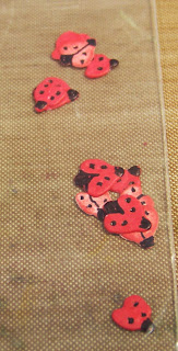
These are from a Spellbinders die set called Winter Evergreen Foliage & Ladybugs.  The foliage is pretty large, ranging from approximately 2 1/2" to 4 1/2" in length.  The ladybugs, on the other hand, are tiny - smaller than my pink fingernail.  I have learned that for some of these small embellies, it is best to put them in a 2" x 3" little zip lock baggie before putting them in the book.

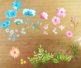
I also made some flowers from the Spellbinders set called Simply Perfect Layered Blooms.  Here's a quick look at some of those.

I had intended to make a set of blue, one of pink, and one of yellow/orange, but when I went to start coloring my second set of flowers, I mistakenly grabbed the blue again and had almost all of them colored before I realized my mistake!  So, I have quite a few of the blue ones!

I sure wish I had thought to do this with my Seahorse Gardens, Under the Sea, and Water You Up To? sets!  Those would be nice to have!

Wednesday, June 19, 2024

HD Perfect Days - Bicycle Blooms

Today I have another set of cards from Hunkydory kit called Perfect Days - the set called Bicycle Blooms.  Here's what the set looked like:

As you can see, there was a sheet of AS (adoreable scoreable card stock), and one and a half sheets of die cuts.  I used these, and some stuff from my stash, to make 4 cards:

I thought I was going to get 5 cards from it, but ended up not wanting to use a bicycle tire that you could see the birdbath through - since the rest of the birdbath would not be there.  I just layered the extras on the cards.

Card #1:

The entire panel here was cut from the AS - complete with focal.  I inked the edges, glued it in place, and added more die cuts - including sentiment - easy peasy!

Card #2:

This card was my take on a sketch challenge on the message board I frequent.  I started with the dark pink panel, inked the edges, then added a couple of patterned papers whose edges had also been inked. Then I added the focal. I added 3 Dazzle border strips - being careful to take them in front of the flowers and behind the bicycle (a second bicycle piece I glued on top of the first).  Finally, I added the sentiment & some "tails" for it.

Card #3:

I wanted this card to be a slimline card - so cut a piece of the AS and added borders top and bottom, along with a couple scraps of the AS.  I inked the edges of all, then added the bicycle piece - cutting it to fit.  After gluing the panel in place on the card front, I added a sentiment & mat.  The mat will stay, the sentiment will be removed until such time as I know the occasion for which I'll use this card. (Sassy's LLC sentiments are great for doing this!)

Card #4:

This final card was also cut from the AS.  I added ribbon from my stash and covered it with more bicycle and flower pieces.  Once again, the mat will stay, but I'll remove the sentiment and add an appropriate one later.

Tuesday, June 18, 2024

Digi-Dogs

Today I have three cute dog pictures.  All three use two printed digital papers - each printed at half a letter size -  focals made from Stampendous Pop-up Puppies stamps and dies, and a bit of ribbon.  

Card #1 (above): As you can see, this first one uses ribbon as a leash.  To make these, I cut both papers to the correct size for a card front that would leave a bit of white showing around it.  I then used a die to cut the middle out of both  papers.  I glued the outer part of the dark paper in place.  Next, I took the inner light colored one and matted it on white before adding it with sticky-backed foam to pop it up.  Unfortunately, I discovered that with the wobble spring for his head that made the card too thick to go through the mail as a standard letter.  So, I left the foam off of the next two. 

Card #2:

As you can see, this one is the reverse of the last with the larger light-colored piece on the outside and the darker on the inside.  On this one, I used a leftover piece of ribbon that made it look like his leash is too short.  Oh well.  I think when I know how I'll use these first two, I'll add a strip sentiment to the front of them.

Card #3:

 
This one has room for a small sentiment in the upper left corner - once I know what occasion it will be used for.  The dog is from the same set, but a very different look because I used a different head for him.   At this point I also only had leftovers that were not large enough to cut for card fronts.  So, I split the lighter colored one and put it either side of the darker - adding ribbon to set them apart before inking the edges and gluing the whole to the card front.  This dog didn't get a leash, but his head is still on a wobble spring.

Monday, June 17, 2024

Scrapbook Card

Today I have a quick card that I made using leftover papers and photos from the India scrapbook I just completed.  You can see the card front above.  I mostly just used photos and papers, but you can see on the card front that I die cut a title and used some Jewel Border Dazzles to spice it up.

When you open the page, you see the above.  I wanted to embellish these pages a little, but all I could think to do was to add a few corner stickers.  Maybe I'll go back in and add a couple of comments on bits of white paper.

Opening the last page gives you this full spread - below you see a closer pic of the last two pages that were revealed.


Sunday, June 16, 2024

India Scrapbook Pages 34,35,37

Today's pages bring me to nearly the end of this album - just one more page to go!  At any rate, these are pretty straight forward.  You can see the dual page above, here's a closer look at each page - and an additional.

Page 34:

This page is pretty straight forward - background from DCWV stack, pictures matted on black, black ink around journaling.  The only other thing is the title.  This, I cut from the DCWV mat stack of the same name & matted it on gold mirri.

Page 35:

Again, pictures were matted in black & I inked the edges of the journaling with black.

Page 37:

This beautiful background paper was from a DCWV mat stack.  The title and journaling were printed using Microsoft Word.  I matted all with gold - and made a little golden vellum pocket to hold the little calendar cards they were handing out - each with a different picture of the temple.

Page 38:

Last page for this album!  Pretty straight forward.  Page is again from the Taj Mahal DCWV Mat Stack.  The red part of the title was die cut using my fancy alphabet set - then matted on rounded corner gold mats.  Dots following were punched from the same gold with a regular punch.

Saturday, June 15, 2024

Stampscapes - again


Today's card is the result of some playing with my Stampscapes stamps.  After stamping out the scene with StazOn ink, I started coloring the scene.  Some of it was colored with Distress inks - some with my Scroll and Brush markers.  The sentiment is one from Sassy's LLC and is removable so I can just add whatever sentiment works best to it when I decide the card's recipient and know the occasion.  The plaid paper is an old HOTP print.

Friday, June 14, 2024

India Scrapbook Pages 33 & 36


Today I have a couple more pages for my Indian scrapbook - though these two pages will be separated by a dual page layout of the Taj Mahal which I haven't created yet.

Page 33:

This first is pretty straight forward with most of the photos matted with red and/or blue glimmer paper from my stash.  The title was printed using Microsoft Word (as were the journaling blocks and photos).  For the title, I used the gradient effects to blend colors.  I fussy cut a couple of small pics to add to the printed border.

Page 36:

The background for this page is a beautiful mosaic foiled print that I thought was reminiscent of the inlaid work being discussed on the page.  I created an inlaid title using gold foil tag board and letters cut from the mosaic background behind the journaling panel.  The focal was matted on gold with gold decorative corner stickers.

Thursday, June 13, 2024

India Scrapbook Pages 30 & 31 - Plus Stencil Card

Today I have two scrapbook pages and a card.  First the scrapbook pages.

Page 30 (above): Because the journaling is mostly about food - including oranges - I used a page of oranges for the background.  I rather liked the way the title and journaling blocks came out - all done using Microsoft Word, including the pictures.  

Page 31:


I'm not sure this page is complete, but I haven't yet figured out what embellishments I might add. As you can see, it's pretty simple - with printed pictures and a joint title/journaling block.

Stencil Card:

I got my first set of layering stencils today, and just HAD to try it out right away.  This is a Taylored Expressions Poppy Fields set of 4 stencils that work together to create a scene.  These are the colors I used for each layer:

  • 1st layer = Barn Door (distress ink)
  • 2nd layer = Candied Apple (distress oxide)
  • 3rd layer = Peeled Paint (distress ink)
  • 4th layer = Black Soot (distress ink)
After cutting my sample to size, I matted it on black and then green - then wrapped a grosgrain ribbon around the whole before gluing to the card front.  The sentiment was one of Sassy's LLC - backed with a black mat - punched using an EK Success scalloped circle punch.  This was added with foam squares - along with the little bee (die cut from a Elizabeth Crafts die set called Honey Bear).

Wednesday, June 12, 2024

India Scrapbook Pages 28 & 29

Continuing with my India scrapbook, you can see page 28 above.  It is a pretty straight forwards layout.  Pattern of background is another pretty Indian-look pattern.  I created the title with alphabet dies and leftovers from the blue pattern used to form the wide photo border on the right of the page.  The yellow was scrap from my stash. Unfortunately, I didn't have any more of the right color of yellow, so printed focal photo and journaling on white and colored them with my Scroll and Brush markers and a water brush.  It worked better than I was afraid it might.  It's not easy to see in the picture, but there is a narrow yellow border setting off the blue border.  That was stickers from my stash.

Page #29:

I always find it a bit challenging to use photo papers for scrapbooking, though this one of a beach scene seemed perfect.  I finally decided on the layout you see above.  The birds and "Beach" title were stickers from my stash.  I printed the journaling on a clear label paper so it would be see through to the beach scene.

Tuesday, June 11, 2024

India Scrapbook Pages 24-27

Slowly, but surely, I'm making progress on this album - after these I have 10 more pages to go.  Pages 24 & 25 are shown above, but we'll take a closer look at them below:

Page 24:

This was a challenging layout - so many pictures (some much poorer quality than I would have liked), title, journaling, and a brochure from the site that was printed on very flimsy paper.  How to fit it all in?  As you can see, I made a vellum pocket for the brochure that would hold the brochure if I folded it in half.  Since it had already been folded that way, I wasn't concerned about doing so.  The pocket was easily made. I simply folded my vellum around the brochure such that there would be a little wiggle room - then trimmed all selvage except for that on the front - which I glued to the back to create the pocket.  I also made a little thumb hole using a 3/4" circle punch.

It took awhile to figure out how to get the map (which had such tiny print it had to be printed in a large size or was worthless) and the pictures/journaling/title that I wanted on this page.  As you can see, I glued the title to the front of the brochure pocket, the journaling at the very bottom of the page, and then printed the map and photos as a group such that it would fill the remaining space. (Map by Gatis Pāvils - http://www.wondermondo.com/Countries/As/India/Maharashtra/Ellora.htm, CC BY-SA 3.0, https://commons.wikimedia.org/w/index.php?curid=9796513).  I was pretty happy with the result - except that as I was writing this up I realized I forgot to number the photos as intended to correspond with the journaling.  I'll have to go back and do that, but doubt I'll re-take the picture.

Page 25:

I decided to print all of the remaining photos in a relatively small size (2.5" x 1.8" or so) and arrange them collage style.  The hardest part of this was gluing everything in place without forgetting how I had it laid out!  I finally pulled it apart and started gluing from the center out.  That worked relatively well.

Page 26 & 27:

This layout was nearly as challenging as the last, with lots of photos and journaling.  I finally decided on a few photos to represent the journaling.  I numbered these to correspond to the journaling and printed them along with the title (which is taken from a photo of a sign that was there).  Then I realized it could work to put all of these in the center of the layout and then create a border top and bottom that could hold a bunch more photos that were printed in a standard small size.

Page 26:

Here's a close-up of the first page.  The background paper is from an old DCWV mat stack called Happy Ever After (or something like that).  I found a brick paper in my stash that I cut in 4 strips to make the borders for this page and the next (with a little left over).  I added the black wider border strip stickers from a Dazzles set. to set the borders apart from the background.  I also used a black Sharpie pen to border the title to help it stand out better.

Page 27:

As you can see, this second page is similar to the first, but has the journaling blocks instead of the title block.

Monday, June 10, 2024

Making Embellishments with my New Dies

I've made a bargain with myself that I can't put new dies away until I make a sample for my catalogue (This "catalogue" is a notebook where I put samples of my dies by theme so I can easily find what I want.)  Here's a sample page:

I am starting to collect some lovely dies, but I find that I seldom want to stop in the middle of making a card to create a focal, so it's nice to have some made ahead.  

So, this time I'm experimenting with a second bargain.  Not only am I making a sample for my catalogue before putting my dies away.  Now I'm also trying to make extras to have in my embellishment notebook so I start to create a stash of ready made embellishments/card focals.

This post is the result of that decision.  AND I'm choosing to add a few tips & tricks here that will make it easier the next time I want to make these.

#1 - PANSY

These flowers/leaves are made using a Spellbinders' die set called (surprisingly enough) Pansy.  I started just cutting out the pieces and trying to figure out on my own how to put them together, but soon realized my finished flower didn't look much like the picture.  So, I decided I better watch the YouTube that I knew the designer had created to show us how to make these flowers.  Here's what I want to remember to do:

1) There are 3 dies - one for the leaves & calyx, one for the lateral petals and anterior petal, and one for the posterior petals.  The first and third dies say to cut them twice, but you only need one set of the 2nd die. When you die cut, make sure that those cut from the 2nd die (lateral & anterior petals) are cut from either light colored or white card stock.

2) If you started with colored paper/card stock, ink the edges of all your pieces.  (Not sure if this will be needed if you start with white?)  Set the leaf pieces aside and start working on the flower.

For the Flower:

1) If you started with white, color the petals a base color - front and back.  Next, take a marker and add the "face" part of the pansy by using light short strokes from near the bottom of the petal a little way up the petal.  For the wider petals, don't go as far in the center, making it look a little like the top of a heart.  It's best to let these dry before shaping because when the ink is damp they're more likely to tear.  Note that the base of the anterior petal has two tiny "flaps" that you fold up to form the stamen.  These portions need to be light colored - preferably white!

2) Next, for each petal, turn it upside down on a soft mouse pad or molding foam and use the larger of my double-headed embossing stylus (i.e. NOT my large "flower" one) to soften the edges of the petals by pulling the stylus gently from near the edge to the edge, going all the way around the main part of the petal (not the base).  Then, turn the flower over and start to draw the stylus down from near the top of the petal to near the base of the petal, going around and creating what feels like "rays" that all end at the base of the petal. Make sure you do NOT go into the center of the double-petal - just to the edge of the center!

3) Take your small stylus and for each petal, place it right side up on the mouse pad or molding foam and gently poke down in the center.  This will cause the bottom to create what looks like a little flap that you can add glue to for assembly.  Then, take your tweezers and gently roll just the very edges of the petals to the back.  Now you just need your calyx piece (which should have been cut with the leaves and should probably also be green though it may not be seen in your final project. 

4) If you look at the calyx piece carefully, you will see that there is one of the five little petals that is more by itself.  Then you have two that are on opposite sides, then you have two that are close together - on the opposite side as the single.  Use this info to help with placement.  The two close together opposite the single are where you will place your posterior petals - the next two are for the double petal - the last is for the anterior petal.  

5) Before starting assembly, rub your stylus in the center of the calyx piece to shape it (little petals will sort of fold up around the stylus).  Now take your posterior petals and add them using a bit of glue on the back of the base of each petal.  Next, add glue to the center of the double petal piece and arrange it to attach to the next calyx little pieces.  Finally, add glue to the base of the final petal and glue it in place.

For the Leaves:

1) Place each leaf right side down on your soft mouse pad or molding foam.  Use the smallest embossing stylus, draw the main leaf stem from base to near the tip.  Lightly fold along this line so the center of the right side is available to ink along the vein.  

2) Put it back on the pad - right side down and draw the rest of the veins - from the stem to near the edge for each "bump" of the leaf.  

3) Now, using a pair of tweezers to hold the base, fold the bottom of the leaf along the main vein (right sides together) and turning the leaf right side down once again use a large stylus to roll near the top of the leaf.  You can now add it to the pansy as you choose.

#2: HAPPY FALL

For these, I die cut the bushel basket from a wood plank paper.  Because it was paper, I cut it again from white card stock and glued the two together so it was more sturdy.  I cut the apples from red card stock and then colored the stem/leaves with green pen.  This worked okay, but it might be nice to cut them from white and color them.  Either way, it might have been nice to ink the edges.  The words were also cut from the red card stock.  I glued the apples to the basket - might be better to just leave them loose next time as I did with the sentiment.

#3: ALL THE TOOLS


I LOVE these tools! I did learn a couple of things.  First, using foil tag board or mirri board is REALLY nice for making these.  I not only used it for the silver, but also for the black and maroon.  A wood-grain is really nice for the paintbrush handles.  It's really nice to make multiples at a time so that you can somewhat mix and match the colors.  I also decided not to add the "paint" at the end of the paint brushes, but just put it with them.  This allows me to choose the right color of "paint" when I use the paint brush on a card or layout.
Sunday, June 9, 2024

India Scrapbook pages 22 & 23

I have a couple more India Scrapbook pages.completed.  It takes far longer than I think it should, but I AM making progress.  I really want to get this finished!

Page 22:


I thought this background paper was a good one to symbolize the silk factory.  The mats were all made from a shimmery golden vellum - one was punched with a corner punch to allow me to add the postcard without adhesive (it has Indian stamps, postmark, and message on the back).  The die cut title (no name sans serif dies) and the journaling both are inked photo paper.  As you can see, I double matted the title, rounding the corners with a punch. The focal photo mat was created using a Spellbinders die called Renaissance Jeweled Frame.

Page 23: 

The background card stock really speaks to the shapes and colors of India.  The title was die cut with no-name fancy alphabet dies.  After looking at this, I think I'll go back and add some border stickers to add a bit more decoration - but probably won't take an updated photo.

Saturday, June 8, 2024

India Scrapbook pages 20 & 21

I spent all day working on this layout.  It was really challenging because I had so many pictures I wanted to use and had to pare down - then had to figure out how to fit everything that made the final cut.  Here's a quick look at each individual page:

Page 20:

I have title and journaling blocks on both pages that were created in the same way.  The title blocks were die cut from a scrap of old scrapbook papers that had a light cream colored pattern to it - die was from Spellbinders' Romantic Rectangles Two.  The large letters were die cut from a red metallic card stock using my large Momenta Thin Alphabet dies.  I then drew around the outside of the dies on the back of some gold metallic and fussy cut it to form a mat for the red.  I cut the remaining letters from gold using Sans Serif dies.  I really liked the look of that patterned paper, so cut it out of the center of another sheet of that paper (it's actually a border paper) and cut it to 8 1/2" wide.  It was only 8 1/4" long, but I was able to create my journaling blocks on a standard letter sized layout and print it.  Then I used a Martha Stewart border punch to punch around the edges of these journaling blocks.  Finally, I matted the focal print on a gold piece that was die cut with a die from Spellbinders Resplendent Rectangles.

Page 21:

This page is similar to the previous one with one additional feature - a pocket for an envelope that holds several purchased postcards of Mysore Palace.  I made both pocket and envelope from iridescent gold vellum.