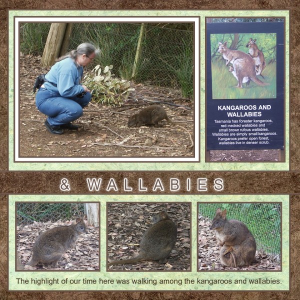
Today we look at layouts with FIVE photos. For five photos I often use photo and journaling blocks. In this first example you can see that there are basically two blocks. The first has the focal photo and a photo that gives information about it. The second is a strip of three photos with journaling. Note that the focal photo is made to stand out more because it is triple matted (brown, white, brown) instead of just having the brown mat that the others have. The addition of the white mat really draws attention to the focal photo on this page, though with the picture also being the only one with a person in it, it would stand out anyway. It's a little hard to see in this picture, but the light green blocks are also matted with the same brown. This helps to pull everything together.

Here's another example of photo and journaling blocks. In this case, all five photos are layered onto a single block with the focal photo being much larger. Since the person in the photo is also larger, this makes for a clear focal. The journaling is printed onto the same color as the photo block, and the title is also cut from this color. The use of one color for mat, journaling, and title, helps pull the page together and contrasts nicely with the background colors of the page.
Sometimes it can add interest to layer the focal on top of the other pictures, as in this example. As you can see, this layout sort of creates a 9 x 9 grid, with photos, title, and jornaling filling various of the spaces in the grid. However, the focal photo is larger and layered on top to really make it stand out.

It can be interesting to not only layer a photo, but make it a different shape, as you see in this layout. This page is basically a grid of 6 with one block being the journaling. This journaling block also demonstrates a fun technique that I use. In this case, I took one of the photos and lightened it considerably to use as the background for my journaling. This creates a subtle look that doesn't clutter up the journaling, but still creates an interesting look. There IS a problem with this page. There's a fight for focal between the larger shaped photo and the photo in the upper right. While ordinarily an unusual shape like this would pull all the initial attention, the bright pink in the other photo and the fact that there's a person there and nowhere else, pulls the eye from the oval photo. You'll also notice there is no title on this page. That's because it is actually part of a two-page spread - with the ACTUAL focal photo being on the other page (thus resolving the "focal fight"). :)


No comments:
Post a Comment