Please let me hear from you!

This blog is for sharing a love of paper crafting. I love paper crafting -
and Stampin' Up! products in particular -
so much so, that I became an independent Stampin' Up!®™ demonstrator earlier this year!
Full disclosure: I get a small commission on purchases made using Stampin' Up! links from this website - but this in no way affects your price. It just serves to help support my blogs. Thank you in advance for that support!

As of January 21, 2026, most of my Stampin' Up! makes are moving to
https://cheringloveofpaper.blogspot.com/.
Most of my makes will be using Stampin' Up! products and be on that blog,
but any makes from other materials will still be posted here.
Enjoy browsing my blogs, and I'd love to hear from you.
It is what helps make the time I put into these blogs feel worthwhile, and always brightens my day.

NOTE: All Stampin' Up! Images © 1990–2026 Stampin’ Up!®

Friday, April 7, 2023

HD Perfect Days - Cutest Kittens

Today's cards all started with another Hunkydory set.  This one is from the kit called Perfect Days - the set called Cutest Kittens.  It's from a 1/2-set they call "deco-large" which usually means there are two complete images - one die cut meant to serve as a base for the other "deco" die cut pieces, and usually another one on the accompanying sheet of AS (adorable scoreable printed card stock) as is the case with this set.  Here's a picture of the 1/2-set:

The main background die cut is on the smaller sheet.  The other page has die cuts intended to form layers on top of it - each one getting smaller and smaller.  Especially with these deco large sets, I like to make a challenge out of it.  Instead of making one card with a massive set of layered die cuts on it (and maybe an additional one from the AS sheet), I see how many cards I can make with creative use of the die cut layers. This time I got 6 cards - you can see them all here:

Now for a closer look at each:

Card #1:

I decided to start with the smallest pieces and see if I could piece some sort of scene from them - the cats were only heads and the wheelbarrow was missing a wheel.  I think I did a pretty good job of making it look otherwise.  The background was a piece of card stock from my stash.  After building my scene on it, I added a double layer of ribbon across the top, and matted it all on tan card stock.  The sentiment is stamped (one of my Mom's stamps), die cut and matted using dies from a Stampendous Make It Pop set of dies. Then I finished it with a couple tiny die cuts on the sentiment.

Inside:

Inside, leftover pieces of the card stock with ribbon as on the front serves as a backdrop for a cat sticker from my stash.  A stamped sentiment (Crafter's Companion Compendium {CCC} set - sheet called Birthday-Female.

Card #2:

The plaid background was printed from a digital freebie I got somewhere. This die cut was also missing it's wheel and had a space between the grass/flowers and the wheel barrow that looked really weird.  I decided it was the perfect place for the die cut sentiment (from the set).  As you can see, I rounded the bottom corners & matted it on cream colored card stock from my stash before adding it to the plaid.  Next, I added the double ribbon border and rounded the bottom corners of the plaid before gluing it in place on the card front - which also has the lower corners rounded.  I found another sentiment in my stash & added it in the upper left corner to finish the card front.

Inside:

I had a couple small strips of the plaid left over, so used them for borders as you can see.  Another stamped message (this again from the CCC - sheet called Thinking of You), and a couple stickers from my stash finished the inside.

---------------------------------------------------------------

After making this card, I found I really didn't like it.  The plaid made it feel to me like a masculine card but I figured lots of guys wouldn't like all the pink.  SO, I covered up the pink ribbon on the outside and used a different sentiment, changed the stickers on the inside, and took a red Sharpie to the pink flowers.  Here's what I have now:


Card #3:

This card started with a piece of the AS - simply thin matted it on green paper and added a sentiment (from the set).  Quick & easy!

Inside:

I had a hard time knowing what to do with the inside of this one.  Finally decided to die cut a piece of the green, stamp a message on it (another from CCC Birthday-Female), and add a couple small die cut pieces.

Card #4:

This is the main die cut base that I'm using as a focal.  Much of the AS sheet was this very light colored print and I didn't like the die cut on it plain - decided to mat it on lavender with inset die cut borders that let you see through to the mat.  Cutting die is from Card Making Magic - the set called A5 Box Kit.

Inside is a simple border made from leftover of the AS & lavender - with a cat sticker from my stash to fancy it up.  The stamped sentiment is the same as that on the first card in this set.

Card #5:
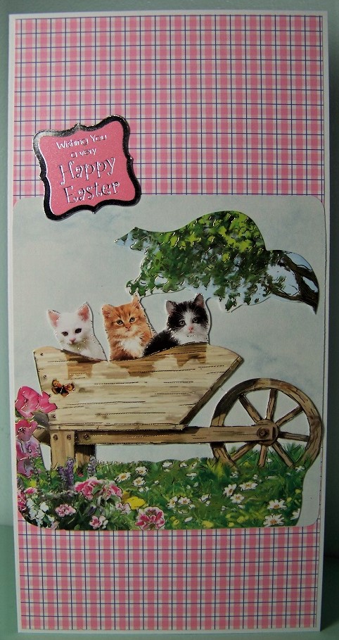
Here the focal is a wheelbarrow full of kittens against a blue "sky" type paper.  This was simply placed against a pink plaid background from my stash.  I found an Easter greeting in a Hunkydory Little Book of Essential Sentiments, and called it good (after all, I need it for tomorrow!).

Inside:

As you can see, I've simply got a border strip from leftover paper, a sticker, and a couple of stamps (CCC - Thinking of You and Celebrate)

Card #6:

This card, for the twin of the recipient of card #5, is similar, but done in yellow:

Inside:

Here too, the inside is very much like the previous card - just a different color.

Friday, March 31, 2023

March Special Materials Swap

Today I have the March Materials Swaps.  This time, the requirement was that a "special" paper or card stock be included in the set of materials that were sent.  Here's a picture of the materials I sent my swap partner:

They include: card base, gold poster board, white hand-made fiber paper with gold stars and dashes, ColorMe topper and embellishments, die cut greeting, gold braid, flower sequins.  The ColorMe was from HOTP, the rest was just in my stash.

The card I made is shown at the top, but I'm posting again here as I talk about what I did:

I started by fussy cutting the ColorMe, then layering that on the handmade paper as you can see in the picture.  I added a gold frame with part of the ColorMe overlapping it, added the gold braid at the top where it is just peeking out from under the frame, added the embellishments, sequins, and die cut greeting (Moonstone Minis-Happy Anniversary), and called it done.

Materials From My Partner:

She sent white, tan, and red card stock, green mirri board that has a bit of a distressed look to it, some elements from a Hunkydory set (Pop A Topper - Gentleman's Pick), some tan buttons, and some metallic cords - lots of pretty things to play with.  Here's the card I made from her materials:


The green mirri was matted on tan, but before doing that, I separated the cords & used 2 gold & 1 red piece to form a bit of a border that wrapped around to the back.  I added the frame with foam tape, then centered the focal flush within that.  The "Happy Birthday" is flush and sticks under the frame.  The "Just for You" is also on foam tape, resting on the frame.

Inside:

Inside I used scraps of the mirri & tan card stock - along with the cords - to create a backdrop border with two more die cut pictures.  A die cut greeting near the top completed the inside.

Printing Photos for Scrapbooking

Today I have a hint about how to ensure you print your photos the size you're going to need when you make a scrapbook.   I use Microsoft Word for printing my photos, and that program makes it easy to crop photos and size them as I want.  But what size DO I want?  I hate printing a photo, only to find it's too big or too small for how I want to use it on the scrapbook page.  Such a waste of ink and photo paper!  If you can find a scrapbook sketch you like that has photo sizes on it, you're set pretty well, but too often I can't - or frankly don't even want to take the time to look.  This is what I've found works pretty well for me:

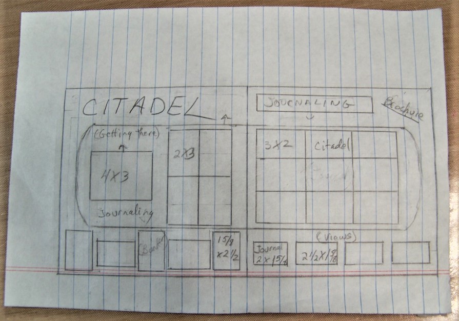
I found that a small pad of paper I got in bulk - Office Depot brand - was PERFECT for sketching out layouts!  It's 1/4" ruled and I used 1/4" to represent 1".  That made it really easy to draw my sketches to scale so I knew what size I needed.  I found on this small sheet of lined paper (approx 5" x 7") I could draw two single pages or one double page layout.  Here are a couple of examples:

Example One:

And here's a picture of the dual page spread I made (already posted in a different post but put here so you can see the comparison) from this sketch:

Example Two:   

This time I sketched two single pages.  And here are the results:

You can see I ended up modifying this a bit when making it - put the pictures closer together and made the bottom border of pictures so it didn't stretch all the way across the page, but the sizes I got from the sketch still worked well for printing the pictures, journaling block, and title.

And here's how the 2nd turned out:

Again, I modified it a bit from the original sketch.  This time I found tickets I wanted to include, so moved the picture that I had planned to have in their spot, to the bottom row - just put them all closer together.  I also decided to print a small closeup of a swan that was on the canal to use as an embellishment. (since it wasn't on the original sketch & I didn't know what size I wanted, I printed this in several sizes, knowing that I would use the rest on cards or something.)

Tuesday, March 28, 2023

Leaving Belgium

Today I tried something different - creating a grid of photos.  Here are those pages - and more.  

Above you see a dual page spread.  Below are closeups of each of those pages.

Page #1:

I'll admit that these pages didn't turn out quite as well as they did in my head before making them!  I wish I had matted the green with white before putting it in place.  That might have helped.  Anyway, as you can see, I added a large piece of green patterned card stock with a rounded edge on one side to serve as a backdrop for my focal photo and my photo grids (on this page and the next one).  As usual, I printed my photos & journaling using Microsoft Word, and arranged the smaller photos along the lower edge.  The title was made from alphabet die cuts from my stash - layered a bit as you can see.  The subtitle was stickers from my stash put on a white photo paper scrap - with edges rounded a bit like the green mat piece.

Page #2:

The second page is similar - the challenging part was the slit & pocket at the top of the page that allow the brochure to slide in and out.  It really wasn't that hard to make.  I've gotten to the place where I make most of my hidden pockets this way - simply cut a slit, cut an envelope to the right size and glue it in place behind the page and lined up with the slit.  Often, like I did here, I'll use a circle punch to create a half-circle pull area.  Because the brochure was pink and didn't really blend in with the page well, I chose to glue some of the green card stock to the top of it.  After cutting to fit, I added a full circle of the green to help ensure that even in the punched out place the pink wasn't seen.

Page #3:

For this page I made another photo grid - this time of saxophones!  I could have used something better for the title, but I was tired & found these die cuts in my stash and decided to go with them.  I liked the blue patterned paper behind the saxophones, but it had a border at the top that I didn't like - so I covered it with tan patterned paper from my stash - and added a narrow black border of card stock between them.

Page #4:


No grid of photos here.  I chose to bring in a bright aqua print mat to focus attention on the birds - my favorite part of that experience.  The background for the journaling is darker than I would prefer, but it's still readable.  As you can probably tell, I used the same set of die cut letters to get my title - this time pulling some of the letters that had aqua in them.  The other thing I should probably note is the shield/sign with the birds - that was a photo of a sign there at the falconry, and I just fussy cut around the sign as a great embellishment for this layout.