Please let me hear from you!

This blog is for sharing a love of paper crafting. I love paper crafting -
and Stampin' Up! products in particular -
so much so, that I became an independent Stampin' Up!®™ demonstrator earlier this year!
Full disclosure: I get a small commission on purchases made using links from this website - but this in no way affects your price. It just serves to help support this blog. Thank you in advance for that support!

Enjoy browsing my blog, and I'd love to hear from you.
It is what helps make the time I put into this blog feel worthwhile, and always brightens my day.

NOTE: All Stampin' Up! Images © 1990–2025 Stampin’ Up!®

Saturday, June 14, 2025

Quick Turtle-y Cards


Today I had several cards I needed to make quickly.  I turned to a fun Stampin' Up! paper pack called Turtle-y Cute.  I used parts of 3 papers from the set to create 6 cards - one Father's Day card and 5 "Un-birthday" cards.  A couple of the papers have pretty background scenes that I made use of. Here's a quick look at details for each card.

Card #1 (above):  I fussy cut pieces from the 3rd piece of paper - in this case the grill and grill master - and glued them to the background scene after inked the edges.  I stamped a greeting in red using a stamp from the Beside Me stamp set from Stampin' Up!, punched an oval, inked the edges, and added to the card with foam tape.

Cards #2 & #3: 

I made a couple of cards using the beach background scene (this one and the next one).  Again I inked the edges of the scene.  This time I stamped the greeting directly onto the background after fussy cutting a bunch of pieces from the other paper and creating these beach scenes.  The greeting stamp is an old one from JustRite - a set called Royal Antique Labels One.

Card #4:

This time I used the stage background to make a card for a grandson who enjoys singing - though I'll admit the turtle doesn't look much like him!

Card #5: 


This fun picnic scene was created in a similar way - this time adding a punched oval with the sentiment.

Card #6: 

There were several pieces left over from the background scene paper.  I thought the striped paper looked a bit like an awning and the flowered piece a bit like the ground, so I created this scene for my last card.

So there you have it.  Six VERY QUICK cute cards.  So glad to have them finished! 

Friday, June 13, 2025

Otterly Adorable - without Otters!

One of the things I've learned is that a set of themed papers DOESN'T mean you have to stick to that theme!  This is particularly true of Stampin' Up! papers.  They almost always have quite generic patterns on the back sides of their papers that can be used for almost anything.  However, even some of the themed "front" side of papers can be multi-purposed.

The Otterly Adorable set of papers is a case in point.  The otters are SO CUTE that it's tempting to feel you must put otters with the "sea weed" paper for example - but you have options.  Here I've taken a single panel (4" x 5 1/4") of sea weed paper for each of 3 makes, to show what I mean.

Card #1: 


Here I cut an inch and a half off the bottom of the panel and flipped the top part over to use the watery back side of it.  Adding some otters certainly makes for a cute card.  The otters were die cut (using the Otterly Amazing cutting dies) from another paper in the pack, but could just as easily have been stamped and die cut from the Otterly Amazing bundle.  The sentiment was stamped from the Sentimental Rose stamp set (discontinued).

Card #2: 

Thinking "outside the box" a bit, I realized that the sea weed could just as easily be jungle plants!  So, I did a jungle make using a monkey die cut from my stash (Karen Burniston die).  The sentiment came from a Hero Arts stamp set called Thinking of You Stamping Village (oval cut with Double Stitched Oval die from Kat Scrappiness).

Card #3: 


This time I sliced a vertical piece and flipped it.  The "sea weed" here can be thought of as plants the ladybug likes to climb on, OR as simply a pretty generic background.  Either way, it makes a pretty backdrop for this ladybug I found in my stash (Elizabeth Crafts Die).  The sentiment is an old JustRite stamp from the set called Your Special Day.

Saturday, June 7, 2025

Scrapbook Pages

Today I have several Scrapbook Pages.  They are mostly made using old papers and scraps that I need to use up, so most are not from Stampin' Up!  I started working on this scrapbook back in 2020 and only got a few pages made over the years since then, so I REALLY want to get it finished! 

The picture above is the only one that has some things from Stampin' Up! and that is their Flip Flaps!  If you are a scrapbooker, and haven't seen these, they are a game changer that I believe will really take my scrapbooking to the next level.  I learned about them after I had completed pages 10-13 and you can see that page 10 has more pictures on it than I should probably have tried to put on it - makes it pretty busy.  The dual page layout (pages 14 and 15AB) would have been the same except that I had discovered Flip Flaps, so have four of the pictures hidden using them - allowing for a much better layout!  Here is a look at pages 10-15AB:

Page 10:


This page is not one of my favorites.  It's too busy.  When I made it, I did not know about Stampin' Up!s Flip Flaps.  That is something I'll be using on one of the pages near the end of this post - but I won't be able to show them to you yet, because I don't have them!  I've ordered them and am looking forward to getting them soon so I can finish that page!  Anyway, this page would have benefited from something like that - fewer pictures with a couple in a flip flap would have helped a lot.   I also wish I'd made more of the yellow ducks instead of adding the white one and the mallard, but it is what it is.  I DID like the grass print at the bottom and the sky print at the top, but the background papers really get lost.  Definitely not my best example!

Page 11:


I like this one quite a bit better, but I wish I hadn't split the background paper the way I had.  It looks too choppy split basically in half like that.  However, I've had a challenge in the past with embellishing my pages and while this isn't perfect (don't like the row of leaves on the bottom left side), I think I'm starting to learn about embellishing better.  A lot of people just add flowers, no matter what the subject of the page, but I like my embellishments to have some meaning to the page.  This isn't the best example, but there WAS a botanical garden and the founder WAS called Ladybird! :)

Page 12:

Though this page isn't great, there are a couple of things I REALLY like about it.  First, that I have any pictures in the upper section.  I took those from a video and they turned out much better than I thought they might!  2nd, I like the double matting of the upper photos and that they, the title, and journaling are on that rose-colored block of paper.    I like the font used for the title, and the embellishments (though wish I had one more!).

Page 13:


Again, not the best layout in the world, but there ARE some things I like.  1) I love the title block!  I picked that up at a scrapbook store several years ago and this was a great place to use it. 2) I am glad I found a way to make a page despite the fact that we had taken no pictures at the convention! and 3) While the palm trees are smaller than I'd like, I feel I'm STARTING to figure out how to come up with meaningful embellishments.

Page 14 & 15AB:

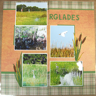
I had real trouble with this layout - everything about it - from finding papers to figuring out a layout, it took me 3 days of trying things, walking away and coming back before I finally figured out what I wanted to do with it.  I'm REALLY happy with the way it turned out, though.  It was worth the wait to figure out how I wanted to do it.  

I like a lot of things about this layout:  

  • The narrow strip of green cardstock between the two patterned papers makes such a difference!
  • Adding mats and bits of mats in the green helps things pop.  
  • I made use of any dies I found in my stash that had grasses, cattails or grass-like features - as well as the little heron/egret die cut.  The grasses and bird embellishments took some time to make, but I'm really pleased with how they turned out, and think they add a lot to the layout.  For the grasses and cattails, I used a die from Spellbinder's Garden Builder set (mostly cut this one in pieces), cattail dies from Spellbinders Holiday Blooms, and the greenery from a Daffodils die set from Elizabeth Crafts (had to trim some of these pieces to meet my needs).  I cut the grass/stalks from green and yellow, and the cattails themselves from a brown suede.  Then I did some inking using a foam applicator (could also have used a blending brush) to make them all look more realistic.
  • I like the way the entire thing feels cohesive - even though it's not only a dual page layout, but the 2nd "page" is actually a gate fold - split down the center.  (I have a bunch of "Gate Fold" sheet protectors in my stash that I bought on a close out from a scrapbook store back in Tennessee a LONG time ago.  I appreciate being able to use them from time to time.  I'll miss them when they're gone as I have no idea if I could ever get any more.)
  • Instead of cramming all the photos I wanted onto these two pages, Flip Flaps on the first side of the gate fold (see pictures below) allow me to add more pictures without the layout feeling crowded.  I am SO glad Stampin' Up! is carrying these Flip Flaps.  They are SO easy to use and will make future scrapbooks MUCH better!

Close Up of left page: 

Close Up of Right Gate Fold Page:

Right Gate Fold Page with lower Flip Flap open:

Right Gate Fold Page with Upper Flip Flap Open:

I haven't completed the pages you'll see when you open the gate fold.  That will have to wait until a future time, but I'll go ahead and post these now, because an unfolding family emergency means I don't know when I'll be able to get to more scrapbooking.