Please let me hear from you!

This blog is for sharing a love of paper crafting. I love paper crafting -
and Stampin' Up! products in particular -
so much so, that I became an independent Stampin' Up!®™ demonstrator earlier this year!
Full disclosure: I get a small commission on purchases made using Stampin' Up! links from this website - but this in no way affects your price. It just serves to help support my blogs. Thank you in advance for that support!

As of January 21, 2026, most of my Stampin' Up! makes are moving to
https://cheringloveofpaper.blogspot.com/.
Most of my makes will be using Stampin' Up! products and be on that blog,
but any makes from other materials will still be posted here.
Enjoy browsing my blogs, and I'd love to hear from you.
It is what helps make the time I put into these blogs feel worthwhile, and always brightens my day.

NOTE: All Stampin' Up! Images © 1990–2026 Stampin’ Up!®

Saturday, April 18, 2020

Flight of the Butterflies - Pink Sapphire Delight & Pretty in Pink


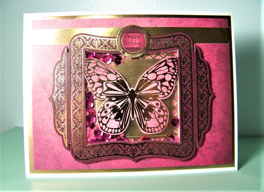
Today's cards once again come from Hunkydory's "Flight of the Butterflies - Jeweled Edition" luxury cardmaking kit.  This time I'm using the pink sets - Pink Sapphire Delight and the "Butterfly Echo" concept card from the sheet Pretty in Pink (and anything remaining from other pink concept cards or pink from mixed color sheets).  This time I made nine cards from the provided materials & a bit of my own stash (including elements from the Hunkydory Essential Book of Pearl Sentiments from 2016).

Card #1: First up is this butterfly shaker card (see above) made from one of the concept card pieces - fussy cut around butterfly, added acetate & then foam tape to create space for shaker elements (sequins & "diamonds" leftover from a diamond painting.   These are placed over top of a die cut piece (die from Spellbinders Captivating Squares) cut from gold poster board.  The background is Adorable Scoreable (AS) from the set & is matted on gold poster board.  A gold poster board mat was also added.  A sentiment from the set completed the card front.

Inside:

Inside are more elements from the set: A frame for a focal used on a different card, letters spelling "HOPE", a strip of AS for a border.  In addition, I stamped a greeting using stamps from two different sets ("You" came from Hampton Arts' Clear Layer Words, the rest was from JustRite's Grateful Heart Vintage Labels Two).

Card #2:

The 2nd card is a tri-fold.  The front was quite simply done - cut a piece of AS and draw around the edge with a black Sharpie pen.  Added a die cut sentiment from the set.

Inside Panel #1:

The inside panel was embossed with a Teresa Collins A4 sized embossing folder (Decor Circles) and then shaded with two colors of ink (Worn Lipstick Distress Ink, and Onyx Versa Fine).  To this I added a couple die cut elements from the kit.

Inside:

The  very inside has a border cut from scraps from the die cut page, along with one of the die cuts.

Card #3:

For this third card I simply took a framed butterfly piece from the concept card (did not punch out the pink surrounding the butterfly as they intended), matted it on a piece of gold poster board (die cut with a Decorative Labels 8 Spellbinders' die), added a sentiment from the HD Essential Sentiments book & a little butterfly from my stash.

Inside:

Inside I simply attached a gold poster board die cut border (Spellbinders Edgeabilities - Classic Ric Rac & Classic Triple Scallop) and a little butterfly from my stash.

Card #4:

This card also started from a piece of AS.  I wanted to frame it with a decorative gold edge using gold poster board, but didn't have the right size die.  SO, I took a smaller piece (die cut with Romantic Rectangles Two die from Spellbinders) and cut it apart to get the look you see in the above picture.  To this I added a narrow strip of gold poster board for a border, a sentiment from the Essential book that was matted on a gold piece of poster board (die cut with a die from Spellbinders' Luscious Labels One), and added a little butterfly die cut from the kit.

Inside:

For the inside, I made a border by matting a scrap of AS on a scrap of gold poster board, then cut each end at an angle.  To this I added another die cut matted on a piece of gold poster board cut with another die from the Luscious Labels One set (Spellbinders).

Card #5:

This card once again uses one of the panels from the concept card.  I started with a strip of AS & a border from gold poster board.  In addition to the butterfly panel, I added a greeting from the set & a butterfly from my stash.

Inside:

Inside I created a border using the same materials as the background on the card front along with a butterfly sticker from my stash.

Card #6:

The sixth card makes use of more of those little alphabet tiles from the set - this time the ones that spell the word "believe".  The background of this card was embossed with a Cuttlebug folder called Rosa by Anna Griffin.  I added distress ink to the raised areas.  The focal is a combination of several things.  I started with a frame from the concept card set.  I backed this with a frame from the other set, and backed that with a scrap of AS.  On top of all this I added a butterfly from a HOTP set called Butterfly Garden Card Kit.  The border at the bottom was made using a scrap of purple Shine Design paper from HOTP (the card has more purple in it than it looks in the picture!), a narrow strip of gold poster board, and the alphabet tiles.

Inside: 


Inside I started with a couple of scraps - gold poster board, AS.  Over this I ran a border strip from the set.  A couple of die cuts from the set complete the inside:

Card #7:

I think this card is one of my favorites.  It starts with a cream colored card, embossed with a Darice embossing folder called Damask.  To this, I added a strip from the border of one of the AS sheets.  The focal and alphabet tiles (spelling "Dream") are from the set (I chose not to separate the narrow frame from the image for the focal).  The greeting in the upper left is from the essential book.

Inside:

Inside is more of that beautiful AS border, along with a couple of die cuts from the set.

Card #8:

Card number 8 again starts with a piece of AS for the background attached to a cream colored card base.  This time, instead of matting it with gold poster board, I simply took a gold Sharpie and drew around the edges. As you can see, the focal is in several layers.  The back layer is gold poster board die cut with a Decorative Labels Eight die (Spellbinders).  On top of that is a piece of cream colored glimmer paper that was die cut with a Labels Eight die (Spellbinders).  Next comes the die cuts - butterfly & "LOVE" tiles from the set; You from a HOTP set called 9 Little Words (die cut from gold poster board); and the sentiment in the upper left from the essential book.

Inside:

The inside repeats these elements with other die cuts.

Card #9:

I thought I was finished with the set at card number eight.  However, I couldn't stand to see that beautiful scrap of AS go to waste so decided to turn it into a tag. 

To do this I cut a piece of card stock with a HOTP die from their 10 Tags and Trims set.    I cut the scrap of AS with just the tip of that die so it would align with the card stock tag.  I then took a couple of colors of Distress Ink (Picked Raspberry & Dusty Concord) to color the top part of the tag - as well as to ink all the edges.  Some ribbon from my stash & a little butterfly die cut completed the tag.  

When I had the tag completed, I realized that it went very nicely with the piece of gold poster board I had sitting on my table (die cut with Romantic Rectangles Two die set from Spellbinders), and would make a great card focal.  I decided to make a tall card with this in the center.  I embossed top and bottom of the card with my Swiss Dots embossing folder (Cuttlebug) and inked the raised areas with gold ink.  I took a square of pink card stock from my scrap box, put it on point, and trimmed to fit as a mat for the focal.  I had the sentiment already stamped in my stash (die cut with JustRite's Vintage Labels Three dies; stamped with stamps from JustRite's Sympathy Vintage Labels), so just added some Distress ink (Antique Linen to change the background color and Picked Raspberry around the edges.) to help it fit in with the rest.

Inside:

For the inside I simply took more of the pink card stock, ran it through the same embossing folder (Swiss Dots), and again hit the raised area with gold ink.  I then cut strips from this to create borders top and bottom.

Friday, April 17, 2020

VIP Die Cuts


From time to time I ordered enough from Paper Wishes to qualify as a VIP and get some extra goodies.  One of those was a die cut sheet from their Butterfly Garden Card Kit.  I decided it was time to use those up - thus this card.   

I started with an Ivory A2 sized card & embossed the front with my Swiss Dots embossing folder (Cuttlebug).  I inked the raised dots with distress ink (Picked Raspberry & Dusty Concord).  The borders were from a die cut from the set - as was the focal sentiment.

Inside: 

For the inside, I created a couple borders using a strip of cream colored card stock that were embossed and inked the same way as the front.  To this I added another die cut and the remaining piece of the border.

There were a few die cuts left over.  I used a large butterfly on one of the cards I'll show tomorrow, and put the rest in my stash to use some other time.

Wednesday, April 15, 2020

Window Swap Card


Today's card was created for a swap - the only requirement was that it be a window card.  Here's the one that I made.  I'm still not great at scene building, so couldn't execute the idea as cleanly as it was in my head, but here it is.

Inside:


Materials:
  • Paper/Card stock - to the card blank itself, I added several papers - a green glimmer paper and a couple of pieces of patterned paper from a Love Nicole paper pad called Prismatic.  I particularly liked the stripe for the walls.  Since the patterned paper ran from wider strips to narrower ones, it helped portray depth and distance in the room.
  • Dies - "window" was cut using dies from Gemini's Window Arches; the word Friend was from their Peek-a-Boo Dog set. 
  • Stamps - The little girl is stamped with Child at Fence Fronts-N-Backs by Art Impressions; the sentiment stamp is from the set Lacy Things (HOTP); fireplace, cat & yarn are from Pawfect Pals (Cardmaking & Papercraft Jan 2020), wall to wall carpeting was stamped with a Stampscapes texture stamp.
  • Coloring - Coloring was mostly done with Inktense pencils & water, some watercolor pencils were also used.  The color on the die cut word "Friend" was ink from a stamp pad. I hand drew the round rug - should have drawn it less round for proper perspective. (Live & learn!)
  • Additional stickers & die cuts from my stash completed the card.

Monday, April 13, 2020

Flight of the Butterflies Jeweled Edition - Amethyst Flight, Dazzling Dreams


Today's cards are more from the HD Luxury Card set - Flight of the Butterflies Jeweled Edition.  This set of cards comes from two sets that were both in purple tones: Amethyst Flight and Dazzling Dreams.  There are also a few pieces left over from the purple concept card(s).  I made TEN cards using these materials (and a bit of stuff from my stash - including a HD Little book of Essential Greetings from 2016).

Card #1:  The first card (above) is a gatefold card.  It is embossed using a Spellbinder's 3D die called European Tapestry, and the raised areas highlighted with a touch of Dusty Concord Distress Ink. The focal consists of a tag from the set & a greeting from the little book matted on a piece of gold poster board that was die cut with a Spellbinder's die from the Romantic Rectangles Two set.  As you can see, the focal was just attached to the left side of the card so it would open easily.

Inside:

The inside was pretty simple - a white card stock piece cut out piece (from a window card you'll see later in this post) was edged with the same Dusty Concord ink and two scrap pieces were added for border strips.

Card #2:

Next up is the first of a several cards created from a portion of the set's Adorable Scoreable printed card stock (referred to as "AS" after this).  In this case, I covered the entire card front with the AS.  I made a tag for the greeting using a HOTP die set called 10 Tags and Trims.  The greeting was stamped with a sentiment from HOTP Just a Little Greeting set.  Edges were inked & stamping was done with Dusty Concord Distress Ink. I added a scrap of the AS at the bottom, a dollar store butterfly sticker and another butterfly sticker from my stash, along with a bit of ribbon.  I finished off the card front by using a bunch of Jewel Dazzle stickers for the butterfly bodies and to highlight the printed border at the base of the card.

Inside:

A couple of scraps of AS for borders and a couple more butterflies from my stash completed the inside of this card.

Card #3:

Here's another card made using AS from the set.  This time I matted it with gold poster board cut small enough that a border of the white card also shows up around it forming a 2nd mat.  I added a glitter ribbon border with ribbon from my stash, then added a focal greeting.  This was made using a greeting from the set matted on scraps - first white, then teal, then gold - the latter being turned on point.  Because of the difficulty photographing this one, I've added a 2nd angle:


Inside:

Inside was once again pretty simple.  Scraps of AS and gold poster board form a border.  To this I've added a little butterfly die cut from the set that was matted on a scrap of the gold poster board.

Card #4:

This card base is made from a large piece of AS - which frankly I didn't care much for (too shabby chic for my tastes) - so only a narrow border of it shows around the edges of the matted focal.  One of the larger die cuts forms the basis of this card front.  I matted this first with a piece of teal card stock that was embossed with a Spellbinders M-Bossability folder called Venetian, then with a piece of gold poster board.  A greeting from the set finishes the card front.

Inside:

The inside is more of the same - embossed teal, scraps of AS, and gold poster board for the border.  Another die cut from the set adds interest to the inside of this one.

Card #5:

Once again I had trouble with photographing this card - it's so hard to photograph reflective surfaces!  It is the last card where the main portion of the card front is from the AS.  As you can see I chose to round the corners this time - of AS, mat, and card base.  The mat is once again gold poster board with a scrap of it forming a border at the top from which hang a butterfly die cut from the set and a sentiment from the little book.

Inside:

Inside we have more of the same - AS & gold poster board borders and a sentiment from the little book.

Card #6:

This set had two focals with separate frames.  I found I preferred to switch which focal went with which frame.  As you can see, this meant this focal was a bit smaller than the frame.  I added a touch of teal behind them (embossed with Darice Wood Grain folder), which I think helps make the focal pop.  The borders are from a strip included in the set.  The greeting is a leftover from a printed Debbie Moore sheet.

Inside:

This is one where I wish I'd made the border a little shorter, but it is what it is.  As you can see, it's scraps of AS, gold tag board and teal card stock.  The tag came from the set, but I added a ribbon from my stash.

Card #7:

This is a little A2 sized card, using up a leftover strip of AS.  I embossed the card front with Cuttlebug's Swiss Dots folder.  The focal is a die cut from the set.  A tag from the essential book with a scrap of ribbon from my stash finishes this one.

Inside:

The inside of this one was pretty simple - just an added scrap of the AS for a border.

Card #8:

By this time I was looking for different ways to use the materials so the cards wouldn't feel so similar.  So, I made an acetate card front for this one - with a orchid card stock piece for the inside/card back.  Layers of die cuts from the set form the focal.  As you'll see in a minute, one of the layers is actually a die cut on the inside.  The borders are scraps from one of the die cut sheets (perhaps of the concept card?).  The frame is a piece left over from the framed focal from the previous card.

Inside:

You can't get much more simple than the inside of this card - simply a die cut glued to the card stock.

Card #9:

For this card, I cut out the inside of the frame to form a window (scrap cut out went on the inside of a card I showed earlier in this post).  This allows you to see through to the focal on the inside of the card. A border strip & sentiment from the set completes the card front.

Inside:

Once again, the inside is pretty straight forward.  It consists of the die cut which was glued in place behind the window, and the rest of the border strip.

Card #10:


This last card was made as an easel card.  The focal was a small butterfly die cut from the set - with multiple mats to make it more prominent.  The mats were cut using Spellbinder's dies - Labels One and Luscious Labels One.  The card front was scored in the center before being embossed with Cuttlebug's Swiss Dots folder.  The focal was glued only to the bottom half of the card front.  A greeting from the set & several "jewels" from my stash complete the front.

Easel:

Here you can see what the card looks like when set up as an easel.  The border is an AS scrap paired with a strip of gold poster board.  A dimensional butterfly from my stash (dollar store) completes the border which is raised up on foam tape so it holds the card front as an easel.

Inside:

The inside has a sentiment - probably left over from the concept card - matted on AS & gold poster board - cut with Spellbinders Labels One and Decorative Labels One.