Today I have a page for each of the 5 additional National Parks that we visited this summer. It's nice to get them finished so soon after we got back from our trip.
Page #1 (above): I started with an old patterned paper from HOTP. It already had a printed inset section like what I wanted for this layout - and it was in the right colors. The elements in the lower corners were stickers that I matted on black. The trapezoid is a fussy cut photo of the carpet as you enter the visitor's center. I have several other photos - and some computer journaling. The title was die cut from some black sticky-backed vinyl, adhered to a scrap strip of white photo paper, with corners rounded.
Page #2:
This page started as a piece of black card stock. I added a strip of patterned paper to the top & bottom, but before I did that, I printed my journaling on the top strip. Unfortunately, it didn't print correctly for some reason, so I had to go over it with a black marker. What a pain!
I like to have the park brochure on my page - but seldom have room for it. You can see the little semi-circle cut out. That is so folks can pull out the brochure if they want to look at it, but otherwise it is tucked away leaving room for other things. It's easy to do. I simply take a standard business-size envelope, glue the flap shut, cut off one end leaving a piece about the length of the brochure, use a circle punch to punch a half circle, and stick the brochure in there. Then I simply cut a matching cut-out on the scrapbook page itself, and glue the envelope with brochure to the back of the page. Easy peasy.
Other than that, I have mostly my photos on this page. I printed them with frames around them. The title is actually simply a picture that was blown up and cropped from the picture you see in the lower right corner.
Page #3:
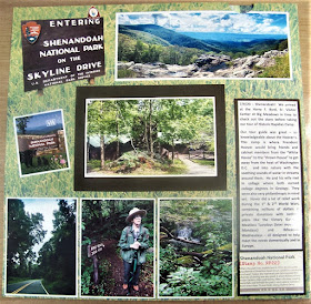
For this page I fussy cut a picture of the entry sign and let it serve as my title. The small picture below that and the bottom set of journaling in the lower right corner are stickers. The rest are pictures. As you can see, I usually simply cut them with a bit of a white border to give them a fake mat. For this page, though, I chose to mat my journaling and the focal photo with dark brown card stock. The background is a page of printed grass that I've had forever because I thought it would come in handy, but found it isn't as easy to use as I expected!
Page #4:
Cuyahoga Valley National Park - quite straight forward - green printed background looks like what we saw on the water at the marsh. NP Stickers are the left-center column. Pictures and computer printed journaling tell the story. Brochure is a pull tab in the top/center.
Page #5:
Indiana Dunes National Park - Once again pictures and computer journaling tell the stories. The picture in the upper left corner is the park sticker. The words on the upper right corner are from the backing paper from that sticker. The title was die cut from brown sticky-back vinyl - stuck to a strip of white card stock with corners rounded. Again there's a brochure you can pull from the center top.


No comments:
Post a Comment
Thank you so much for your comments. They really make my day!