MENU

Saturday, August 27, 2016

Easel Card with 4 Drawers

Today's card was inspired by a challenge on the PW Message Board, though I created it more like I saw on this video.  It's an easel card, with 4 drawers - one on each side.  I plan to add some goodies to the drawers for her birthday, but figure that later she can set it on her desk & keep little things like paper clips & stamps in it. The card itself is 6" square by 1" tall when closed up. 

Materials:

  • Printed cardstock - animal print - 2 pieces that are 6" X 6" (these form the very bottom of the card, and the top part of the easel that you see the cat on), and 4 pieces that are 3 1/2" X 8" (scored at 1", 3.5", 4.5" & 7". These are folded and glued together to form the casings for the drawers.)  Here's one of the drawer casings before it was added to the card base:
  •  Printed Cardstock - striped - 1 piece that is 6" X 12" (scored at 6" & 9" to form the rest of the easel card - which is also the top cover over the 4 drawers), and 4 pieces that are 4 3/8" X 5 3/8" (scored 1" from each edge - forms the drawers)
  • Acrylic Glimmer Paint (Gleams by Decca) - Painted the inside of the drawers with this so they would be cream colored rather than stark white - and thus better blend with the rest.
  • 4 triangular black beads and 4 smaller black beads - for drawer handles - sewn to drawer fronts with black embroidery floss and then glued in place (craft glue) to hide knotted ends & adhere the beads even more securely.
  • ATG Gun - to attach everything together
  • Pink Glittered Fun Foam (from dollar store) - used to cut rug cat is sitting on, bow for cat, flower parts, swirl embellishments & name.
  • Silver mirror metallic card stock - for behind cat
  • Cat (head attached with wobble spring, see how cat was made in previous posts - here & here)
  • Chipboard Letters (for name - holds easel in place - I cut glitter fun foam to go on top of them)
  • Spellbinders Dies - Modern Stationary Cardmakers Die set (for silver behind cat), Scalloped Petite Ovals (cut one side & then the other, to create a narrower oval than is in the die set)
  • HOTP Dies (Paper Artist) - 12 Flower Frenzy (for swirl), 10 Tiny Things & Shadows (for Flowers - this post talks about how I made these)
  • Happy Birthday Die Cut (not sure where I got this - probably in a swap)
  • Hot Pink Stickles - The die cut wasn't the right color so I covered the "Happy Birthday" with pink stickles to match the fun foam.

Here are more pictures of this card:
Front of Card when Closed

Card Opened all the way to see the "Happy Birthday"

Card as it would look when sitting on her desk

Friday, August 26, 2016

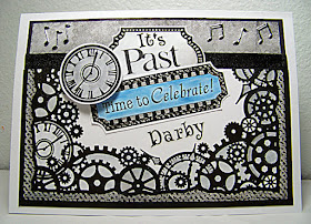
Masculine Belated Birthday


This is a belated birthday card for one of the people that come to our dances.   I didn't know when his birthday was until a couple of weeks after the fact. Most or the supplies came from HOTP.  The background is a mix of an older gray patterned paper and a Color Me Card Topper (Clocks & Gears).  

After cutting the top off the card topper (for use inside the card), I used watercolor pencils to color the topper in colors that blended well with the paper.  At first, I just used shades of gray and silver, but when I went to post it, it just felt so plain, that I added a spot of color in blue.  The blue was blended with Wink of Stella rather than water like I used on the rest of it.  (You can see what the card looked like in just grays at the end of this post.)  I added a stripe of black ribbon and used a Sharpie to create a black border around the gray paper at the top. 

The elements that combine to form the card focal were also from the Color Me Topper set.  The one that says "It's Past" was blank - I added letter stickers from my stash on that, and to spell out his name below.  The clock is on foam tape for added dimension.  

I added a few music notes stickers (Dazzles) at the top, and then attached the topper to my card front.

Here's the inside:


The inside is pretty similar to the front - just a different ratio of gray paper to card topper.  After coloring the topper, I stamped "Happy Birthday" from the HOTP Masculine Collage set of stamps, and colored it with blue watercolor pencils blended with Wink of Stella. The record & word "Dance" are from the same Dazzles set that I got the music notes from for the front of the card.

Here is what the card looked like before I added the pop of blue:


Thursday, August 25, 2016

A Private Message to Me


As you can read a little about on my other blog, in the course of my Bible studies, I was given a very special message, but it wasn't something I felt was appropriate to post in public media - or even in my Bible where anyone looking through my Bible might see it.  Not knowing for sure what to do with it, I typed it up and left it as a file on my computer.  The picture above shows a summary of the message.

This morning, I came across the file on my computer again and several things came together for me.  Awhile back I had created the page about an open door (you can see a picture of it here. It was basically an opaque page insert with nothing on the back of it (except for a couple of smudges that I REALLY wanted to hide!).  I had wondered what to do on the back of the page.  Because of the slick surface of the page, few media would adhere to it unless I used gesso or something similar on it. 
Today I realized - I could print up my special message on a coordinating paper and put it as a hidden message panel on the back of the open door page!
So that's what I did.  I put a text box in the middle of my page and put the message in it.  As I always do when printing on this type of paper, I used a clear embossing powder and heat embossed the printed message as soon as it came out of the printer - so the ink didn't smear on this slick paper.

When the embossing was complete, I took a paper towel and wiped both sides of the paper to help ensure there were no bits of embossing powder clinging to the paper.  Then I sent it back through the printer to print what you see above, on the back side of the page (and then heat embossed it, making sure to hold the paper from the edge with my hand so what was on the back didn't melt and smear!).

After cutting my panel to size, I attached it on the left side with decorative Washi tape.  I figured I'd use a sticker to hold it closed on the right side, but was afraid that the sticker would stick too tightly to the page.  So-o-o-o, I cut a small piece of paper to serve as backing paper for the overlap, and attached a velcro closure.  This isn't something I'd want to do very often in my Bible because of the added bulk, but since this was going on a page insert rather than a thin Bible page, and since I wanted the message to be more private, I did it that way this once.

Wednesday, August 24, 2016

Peace, Be Still!

Today's Bible Journaling piece is about the disciples facing a frightening storm at sea - and how Jesus calmed the waves - read more about that here.  As always, on this blog, my focus is on techniques - and today's techniques were a lot of fun!  I adapted them from something I saw Rebekah Jones do in this video.   In the video, she uses Inktense Pencils & Pitt Artist Pens.  I didn't have those, so used what I had - watercolor pencils & Scroll and Brush markers.  In person, I REALLY like how it turned out - especially the waves.  Here's how I made the page:

Page Prep: For this technique, I used the Dianna Wakely clear gesso from Ranger because it is a very smooth gesso which works well with most art media and I felt it would be quite important for this page.  Using one of Ranger's mini sponge applicators, I applied 3 thin coats of gesso, drying between each layer with my heat tool, and stroking in different directions on each layer to ensure better coverage.  With the techniques I knew I'd be using, I wanted a GOOD layer of gesso!  Then I left it awhile to make sure it was really dry before continuing.  While it was drying, I tried out the various techniques a bit on scrap paper to get a better feel for what I'd be doing.

Water/Waves: I drew out the outline of the waves on some paper - starting with Rebekah's free download, but adjusting them and adding more of my own. I also drew the boat & person in it and cut it out of a post-it note to use as a mask to protect that part of the page while I drew in the waves.  Once I had the waves as I wanted them, I outlined them with a very black marker so I could somewhat see them when I placed the paper behind my Bible page.  Then I took a dark blue watercolor pencil and sketched in the outline of the waves using the paper behind the page as a guide. (remember the post-it note protected the area of the boat & person during the whole process of creating the waves).

From there, I did pretty much what Rebekah showed in her video.  I first used a wet brush to activate the watercolor pencil lines and draw some of the color out (though I didn't have the patience to do as many layers of this as she did - in part because any new layers activated the others - which I could have avoided if I had the inktense pencils).  I made sure this was thoroughly dry before moving on.

Next I used my Scroll & Brush markers the same way she used the Pitt pens - and they worked pretty much the same way.  I laid down a bit of color, and then rubbed it out with my finger to create the look of fading from dark to lighter.  As with her Pitt pens, I only had a few seconds to do this before the ink dried.  But once it dried, it was more permanent than the watercolor pencil, and thus easier to layer.  I used several different colors of blues and aquas, as well as orchid to create a variety of blended colors in the waves.  This technique is so much fun!  AND I found if I got a little color outside of where I wanted it, if I IMMEDIATELY took an eraser to the area, I could remove it!!!  Nice to know. :)

Clouds: I decided storm clouds would add to the feel of the page, but before adding them, I placed a post-it note mask over the verses I wanted to highlight (the mask for the boat was still in place).  I did the clouds very similarly to the way I did the waves (though naturally using different colors!) - using first my watercolor pencils, then water, then Scroll & Brush markers blended with my finger.  I left the upper right corner free as well as an area near the boat, as I knew I wanted to add yellow for light (representing God's peace) to highlight the text, and to reach the boat. (more on that later)

Boat: After the clouds were done, I removed all the masks, then outlined the boat & person with watercolor pencils.  As usual I added water (lifting off some of the color with extra water and a paper towel so the skin wouldn't be too dark).  I added color with the markers & my finger as before. I added a little detail with some very fine (.3mm) Staedtler markers I have ("Triplus Fineliner").

Light: For the light I just used 3 different colors of yellow Scroll & Brush markers - blending some with my finger as I'd been doing for the rest of the page.  The words were hand-drawn with the fine-line Staedtler markers.  I guess I didn't have the background quite as dry as I thought, because it bled a little wider in some places.

Tuesday, August 23, 2016

Open Door


This was another Bible page insert - made pretty easily since it started as a coloring book page ("The Word in Color" Coloring Book by Christian Art Publishers).  I made it pretty easily:
  1. I first colored the page with watercolor pencils (using clear "Wink of Stella" instead of water to blend the color).
  2. Next I scanned the colored page and printed it on a cream colored glimmer paper (though it looks more gold in the picture!).
  3. I find it hard to dry ink printed onto glimmer paper  - and it can sometimes rub off!  So as soon as it came out of the printer, I covered it with clear embossing powder and heat set it.  Problem solved!
  4. After cutting to the correct size for my Bible, I inserted the page using "Zip Lines" adhesive.
Though the page was easy to create, it had an important message for me which you can read about on my blog about my spiritual journey here.

Monday, August 22, 2016

Knocking


I realized that I never posted about how I created this page!  

Materials:  Clear Gesso, Black Pitt Pen, Watercolor Pencils, Watercolor markers, Lightbox

Method:
  1. Page Prep: I started by preparing my Bible page with a couple thin layers of clear gesso so the artwork wouldn't bleed through to the back side of the page.
  2. Image Prep: As with most of my hand-drawn thing images, I started by doing a google search for something related - biblical characters in this case - so I could get some ideas of how to draw what I wanted.  Then I drew with pencil on plain paper until I was happy with the drawing.  I also have several papers that are cut to the size of my Bible margin so I can more easily lay out my words.  Once I had things laid out the way I wanted, I used a light box to lightly transfer the image to my Bible page.  
  3. Coloring: Next, I colored the images and words - then went over outlines with my pit pen.  The yellow light beams around the word "BEHOLD" were made with a marker.

Saturday, August 20, 2016

Leaping for Joy?


This was a really quick page because the illustration was already in my Bible.  I colored the ephod using a light blue watercolor pencil just around the edges and then blended it with a clear Wink of Stella pen.  The lettering was made using a Micron pen and Scroll & Brush Markers.

Friday, August 19, 2016

I Rejoice


More Bible Journaling - I'm not as happy with this drawing as some - hand drawing things is not really my forte'.  I drew the illustration &, after first coating the page with clear gesso, traced it into my bible with pencil.  I colored it with my Scroll & Brush markers and blended with a water pen for a bit of color variation.  I then outlined the picture & did the lettering with a fine-line Sharpie pen.

Tuesday, August 16, 2016

SWEET!


Today's Bible journaling is from Ezekiel, and you can read more about that here.  As usual, on this blog, I'm focused on the techniques used to create the page.

I was really caught by the imagery of eating a scroll filled with "lamentations, mournings, and woe" that tasted like honey - so decided to create a scroll that morphed into a honeycomb.  This was the result (though I wish I had thought to put the scroll over the actual verses to highlight them - rather than just highlighting them in the same color as I did here).

Scroll & Honey: After preparing the page with clear gesso (Art Basics), I started by drawing the scroll on some tracing paper (really incredibly easy to do - look for u-tube tutorials for some easy how-to's - just a couple of curved lines with curls, some straight lines & your done).  Next I drew the honeycomb and dripping honey in the lower right corner.  When this was the way I wanted it, I scribbled on the back of the lines with a soft pencil, then placed it where I wanted it on the page & drew over the lines to transfer the image to my page.  I used a couple of colors of shimmery acrylic paint (Delta) to color my scroll (watering down as needed with my brush to get the effect I wanted).  When it was dry, I outlined it with a black fine-line Sharpie and wrote the words, "lamentations, mourning, woe" on the scroll, and "honey" on the puddle of honey. 

Highlight Text: After finishing the scroll, I decided to highlight the text that the picture referred to - using the same combination of colors I used for the scroll (which was when I realized it would have been nice to have used the scroll here instead! - a bit late for that idea, though. :) )

Background Color:  I decided this bluish Glimmer Mist (sea glass) would be great for the background, but before spraying it, I first cut masks for my artwork and covered it so the spray wouldn't affect it.

Title/Text: Using a fine-point Sharpie, I added the words - hand-drawn.

Bee: As I looked at the page, there was an empty space between the words and the artwork, and the page didn't feel complete.  I realized that talking about sweet coming from painful circumstances, could relate to the bee and it's stinger, and decided I wanted to add a bee.  I had this lovely stamp from HOTP (one of their "Small Stamps"), but knew stamping over what I already had wouldn't work well.  So I decided to stamp in on a piece of my tracing paper!!!  After stamping it and coloring it with my Scroll & Brush markers (and letting it dry), I fussy cut it and glued it to the page with clear gesso! :)  As you can see, it worked well, and had the added benefit that I could go over little pieces with the gesso - kind of like decoupage - to ensure the tracing paper wouldn't come loose.

Saturday, August 6, 2016

Understanding


After my standard gesso page prep, I started illustrating this page.  I have not considered myself very capable of drawing, yet so often I want illustrations for which I don't have a stamp I can use.  This was the case on this page.

The heart was pretty straight forward.  Fold a piece of paper in half. Cut 1/2 a heart shape. Open it up to find a symetrical heart shape.  Then I simply traced this, colored it, drew a scallopped outline with a marker, added a heart shaped outline sticker, and added the words.  Unfortunately, I didn't note exactly what I used, so now can only guess at it now.  There is a bit of a sheen to the pink, so I MAY have used some metallic water colors - or perhaps some metallic gelatos added with a water brush?  (It doesn't appear to be Wink of Stella).  The marker would either have been a very fine line water marker or a scroll & brush marker.

The open Bible was my biggest challenge.