MENU

Friday, April 29, 2011

Napkin Focal

I know it is not anywhere near Thanksgiving, but I'm posting this now for two reasons. First, I wanted to show a card using a focal from a napkin and this was the only one I had right now.  Second, I like to take advantage of the Thanksgiving holiday to send cards to friends and loved ones, with very personal messages telling them specifically what I appreciate about them and thanking them for enriching my life.  This means I need quite a few Thanksgiving cards, so I need to start early with them, just like I do for Christmas cards.

This card is a gate-fold card turned on its side. Opened up it looks like this:
Here are the specifics of how I made this card:
  • I started with a plain white gate-fold card and a napkin left over from Thanksgiving dinner last year. This particular napkin had two distinct parts to it, two striped parts, and two parts with pictures of leaves, acorns and berries.
  • I started by cutting the striped portion a bit bigger than the front of my card and removing the back ply of paper (the napkin was made in several layers pressed together - I removed the back one which was a bit loose -- NOTE: I should have removed ALL other layers from the printed layer - over time if there are more than one layer, the top layer will start to come loose since it's not actually the layer that is glued to the card!).  I glued the top flap completely with a glue stick and lined up the green stripe along the upper folded edge.  Using my fingers, I smoothed it out over the rest of the glue, then went over it with my bone folder to really embed it in the glue. Then I trimmed around the card with my scissors to remove the excess. Then I repeated this for the bottom flap.
  • Next, I cut out one of the picture parts, trimming closely around the leaves, etc. at the top.  I removed the loose ply of paper from the back and then carefully ran my glue stick over the back of the piece I had cut, covering it completely with glue.  This was then carefully placed along the inside bottom edge of the card, smoothed out with both my hands and the bone folder, and trimmed with scissors along the edges of the card.
  • I cut a rectangle of white cardstock and rounded the corners.
  • Then I chose a part of the remaining picture for my focal and carefully cut around it. (Compare the focal to the picture on the inside of the card to see which part I cut out.)  I removed the back ply of paper, then applied glue to the back of my focal and smoothed it in place just like I did in the last step.
  • Using a glitter pen, I drew a thin border around the edge of this cardstock piece, then glued it to the TOP flap of the card (don't glue it to the bottom flap as well, or you can't open your card!)
  • Using a brown chalk ink pad and acrylic stamps from Melissa Frances Crystal Clear Stamps set, I stamped the greetings over the top of my focal.
  • A 1/8" ribbon bow finishes it off.

Thursday, April 28, 2011

Christmas in April!


Since many of us like to make our own Christmas cards each year, it's never to early to get started on them.  So, the last Thursday of each month, I'll post a Christmas themed card to help get us in the mood.  This one was a very quick card to make, since the focal, message, and border are all from the die cut set called "Cardmaker's Instant Card Art - Christmas Colors" from Hot Off The Press. 

Monday, April 25, 2011

Alcohol Inks with Leftovers

Do you have lots of scraps lying around that you just can't bear to throw out?  Make a card!  Today's card is a simple one that used up some scraps.  As you can see, the borders are made from a leftover strip of patterned paper.  The borders for the borders (LOL!) are leftover bits from some peel-off border stickers, and the focal flower is made from the leftover bits from a peel-off flower (probably Dazzles).  Both were originally silver, but I used alcohol ink to color them a color to accent my card. The top border and the sentiment are both cut from adhesive-backed card stock (I used my Silhouette to cut the sentiment), and the white is simply a left-over piece of card stock with the edges inked.

Hint:  To make sure you can get the leftover bits ("innies") placed correctly on the paper, some places offer a transfer paper.  I find it is just as easy to use painter's tape!  Take pieces of the tape and place over the innies.  Slowly peel the tape from the backing paper, taking care to ensure that the innies come off with the tape.  Place on your project and rub to adhere innies to paper.  Slowly peel the tape back, this time taking care to ensure all the innies stay on the paper.  After that I sometimes use a bone folder to just go over them and make sure they are well adhered to the paper.

Sunday, April 24, 2011

Scrapbooking Challenges Part 4 - What a Mess!

The challenge I ran into with this page is that I had it all completed except for the title, but made the mistake of gluing down the piece for the title before writing the title. The title was intended to go on the border paper that runs across the bottom of the photo, but I messed up on my writing and didn't get it centered well. I REALLY didn't like the way it turned out.  Then I realized I could write my title on another piece of the brown and cut it to size after I wrote it (thus ensuring it was centered the way I wanted it). I inked the edges, bordered it with another paper, and pasted it over top of the mess.  Voila'!  The page now is one of my favorites in this album.

Saturday, April 23, 2011

Inspiration of Love

A few days ago in my Core'dinations Creative Frenzy, I shared about making notepad covers (including HOW I was doing it).  This cover was inspired by my love for my husband - done in his favorite colors.  Now I'm busy making another 50 out of my love for friends (including those I haven't met)!  These will be handed out at a special workshop my friends and I are hosting.  Obviously, I don't want to spend too much time or I'll never get them done, so they are pretty straight-forward.  Here are a few samples:


The first two are purchased tags from Paper Wishes.  The last is a digi-stamp I collected (probably from Angelique's site).  The last sentiment is a stamp from a Fiskars set about friendship.  All are enhanced by the use of Cuttlebug embossing folders and my Big Shot machine. The first, as you can probably tell, also made use of some Nestabilities dies.

Inspriation is everywhere. What inspires you today?

Friday, April 22, 2011

Digi-stamp Focals

Today's focal is my first use of a digi-stamp.  I've been seeing them a lot, and started collecting some nice freebies that I saw, but never got around to using them myself.  They are quite popular for card focals.  Here are the particulars about this card:
  • The base card is a blue one from Hot Off the Press, and I believe the paper used for the borders and corner came from there as well. Obviously I used a fancy cut on both edges of the borders, and my corner punch (from Marvy Uchida) creates a similar edge.
  • The digi-stamp itself is one from Angelique's site - probably my favorite site for digi-stamps (because it has lots of cats on it - as well as dogs, mice, and other cute animals).  And they're all free!  Thank you so much, Angelique!!!!!  I printed it on a photo-quality cardstock and then colored it with chalks, pastels, and glitter pen for the beaks and feet (softened with a Dove blending pen).
  • The "Happy Birthday" was the sticker that remained after I removed an outline sticker greeting.  It was originally silver, but a bit of alcohol ink changed it to coordinate with my card.
  • The "from both of us" is obviously done with a glitter pen, and a bit of 1/8" satin ribbon finished it off.

Thursday, April 21, 2011

Thank You Card

Today's card is a thank-you card. It was made using cardstock from a DCWV mat stack. I can't remember where I purchased the flowers for the focal. The triple mats for the focal were cut and embossed with a set of Spellbinders Dies. A ribbon and outline sentiment finish off the card.

Sunday, April 17, 2011

Scrapbooking Challenges Part 3 - Oops, Here's another one!

Have you ever finished a lovely layout - and then discovered another picture that REALLY should go on that page?  That happened to me with this heirloom page.  I was tempted to just ignore the picture that I had forgotten, but it was an important picture of her with her sisters, and really should be there.  The pages around it were already complete, and the layout of the scrapbook just didn't allow for an addition of another page, so that was out.  What to do?

I decided to remove the title, put the picture there, and put the title under it.  Here is how it turned out:
While it's true that I don't like this layout as much as the first one, the most important part of my album is the heritage and heirloom photos, so I feel very good about finding a way to keep this picture with the others.

Friday, April 15, 2011

Die Cut Focals

Continuing our Friday focus on where to get focals for cards, today's example uses a die-cut.  Here are the specifics about this card:
  • This die-cut came to me in a swap and I can't remember who it came from or what they said about it, so can't give proper credit unless you recognize it and let me know!  
  • The background is from the Debbie Mumm Nursery Rhyme Matstack (made for Jo-Ann's fabrics & crafts & manufactured by DCWV)  
  • I matted the die cut on pink cardstock for 2 reasons: I wanted the heart showing through the die cut to be pink, and I was sending it for a baby girl.  
  • The greeting was created with white ink (White Daisy from Close to My Heart) and a stamp from an acrylic baby-themed set from Fiskars.  
  • A ribbon finishes it off (the colors look better in person!)
This gives me a quick and easy card for that new little one.

Thursday, April 14, 2011

New Baby

Here's a picture of a side-step card I made to send to the parents of a new baby.  The teddy bear is a picture I downloaded from the internet & printed out -- probably from my favorite site, Scrapbook Flair. The words are from a Fiskars stamp set, and the papers are from Hot Off the Press.  There are many sites that give instructions for this type of card.  Here's one.

Wednesday, April 13, 2011

My Core’dinations Creative Frenzy

Today is all about Core'dinations Products since I would LOVE to be a part of their design team! It is SO much fun to score, emboss, sand, tear, and otherwise mutilate this card stock allowing the beautiful inner colors to shine through!  Today I'll be sharing three projects I've made with these products: a set of notepad covers, a scrapbook page, and a "Thinking of You" card. 

Notepad Covers

These notepad covers are quick and easy to make, but really dress up a notepad.

Materials:
  • Inexpensive notepads (I got several for a dollar at the dollar store)
  • Core Essentials card stock from Core'dinations - blue & purple
  • Stencil (this butterfly one is from Sandy Art) & Spellbinder's cut/emboss dies (I used "scalloped square" and "labels one"
  • Big Shot or similar machine for cutting and embossing
  • Sticky-backed velcro (just a couple of small pieces)
  • Non-Smear Pastels & Brush from The Stencil Collection (optional)
  • Dazzles Stickers from Hot Off the Press (optional - I used Gold Greetings Stickers and Gold  Border Stickers)
  • Score board of some kind (I used Ultimate Crater's Companion for fancy score lines and Martha Stewart's scoreboard for straight lines)
Method:

  • Cut a piece of card stock a bit larger than the dimension of the notepad in one direction, and an inch or two longer than twice the other dimension. This depends on which way you want the notepad to open -- top to bottom or side to side (see pictures).

  • Decide how you want your overlap (how deep do you want your overlap? do you want a fancy border? etc.)  For the blue one, I scored a decorative line twice at one end (approx 3/8" apart) and sanded it to bring out the core color of the card stock.  Then I trimmed along the first score line to give me a decorative edge. If you are going to do this, do it before scoring the rest of the lines.
  • Next, score straight lines where you need the folds to wrap around the notepad and then glue the notepad in place, as shown in these pictures:

  • Now for the FUN part - decorating!  For both of these, I started with a square of the same blue card stock (the chalked edge makes one look purple, but it IS blue!), ran it through the Big Shot with a Spellbinder's die to cut it, then again with the Spellbinder's die & a stencil to emboss it. 
  • Next, sand both to bring out the lovely core color.  One I left that way, the other I colored with the pastels (using the brush & stencil to keep the color where I wanted it) and added some Dazzles stickers.
  • Attach decorative focals to front of notepad cover. Add Dazzles greeting (if you wish), and attach small bit of velcro for closure.

    Scrapbook Page
    Materials:
    • Core'dinations ColorCore card stock -- Core Essentials & Black Magic in peachy tones,
    • Photos -- in this case, the journaling and title are also printed as "photos" and cut out,
    • Flowers -- the containers don't have a name on them, but the white ones were purchased at Michaels Crafts, and the peach ones came from a set I purchased at Paper Wishes. The centers are "innies" from some Peel-Off borders.
    • Ultimate Crafter's Companion (for doing scalloped scoring)
    • Sanding Block
    • Martha Stewart Border Punch -- Doily

    This scrapbook page demonstrates several of the things I LOVE about Core'dinations card stock.  The black is from the Black Magic Collection and is so much fun because sanding or tearing the black brings out that lovely peach color, AND the Core Essentials line has so many beautiful colors that coordinate with it (and just about anything else!).

    Method:
    • Starting with a piece of Black Magic 12"x12" card stock, trim it to 8" x 11" and score a decorative line along one edge. Sand it to bring out the color, then trimmed along the edge, leaving a little bit of a black border. Back this edge with three coordinating colors of Core Essentials and then add the focal photo.
    • Take the largest remnant of Black Magic and cut it to 8" wide. Score, sand, and trim as before, then tear the top and bottom edges to form a mat for the smaller picture & journaling. Attach this to the page as shown.
    • Using the border punch, punch along one edge of the two lighter colors of Core Essentials, trimming the medium colored one slightly narrower than the lighter one, then adding two smaller strips (thin lightest color on top of darkest color) to form the border you see on the left-hand side of the page.
    • The punch used in the last step cuts off a narrow strip of card stock in the process of punching the border.  Use these scraps to frame the larger photo.
    • Finished the page by adding the small photo, journaling, and flowers.  For the flowers, layer the peach flowers on the white ones and add silver flower centers (the centers are "innies" from the Peel-Off borders). Glue these together and add them to the page as shown. 

      Thinking of You Card
         
        I'd been playing with adding dimension to my cards with straight cuts along the sides & folding at different places, but I thought, "why not try a curved line?!"  The Ultimate Crafter's Companion has a variety of decorative scoring lines, so I decided to use them and see what I could come up with.  This was the result.  The top picture is a scan of the card so you can see the details; the second is a photograph so you can see the 3-d effect.

        Materials:
        • Ultimate Crafter's Companion (for the scoring), 
        • Sandy Art daisy brass stencil, 
        • Spellbinder's Labels Eleven Dies, 
        • Big Shot (or cutting/embossing tool)
        • patterned paper and Teal Jewel Dazzles from Hot Off the Press
        • a sparkly gel pen (blue), 
        • a corner punch, 
        • scissors & paper cutter, 
        • and of course Core'dinations card stock (yellow & blue Color Core from the Roy G. Biv super assortment). 
        Method:
        • Create base card from yellow card stock. (Essentially like the card I showed yesterday, but instead of scoring and cutting straight vertical lines use decorative scoring lines to create a curvy cutting line.) Score, cut, and fold as needed to create this base card.
        • Score decorative lines on the sides of the card and sand them so the lighter yellow shows through.
        • Glue patterned paper to the front part of card (not the sides that you just embossed) and trim to fit.
        • Using largest Spellbinder's die, cut and emboss a piece of the blue card stock. Repeat with the next to largest die & yellow card stock EXCEPT - add the daisy stencil to the center when you emboss this one (I did this step with my Big Shot, but you could use a similar machine).
        • Sand embossed daisy piece to bring out the lighter yellow on the raised areas.
        • Color selective raised areas and border with blue sparkly gel pen; then add jewel stickers for flower centers.
        • Glue daisy focal piece to center of blue embossed piece.
        • Write "Thinking of You" greeting on a strip of yellow card stock with the sparkly blue pen and then round the corners with a corner punch.
        • Glue focal and greeting to card front, slipping greeting in between the layers of the focal.
        • Outline the decorative embossing on the sides with the blue pen.
        Well, there are the three creations I made during my Core'dinations Creative Frenzy.  Here are links to a couple of other Color Core projects that I posted last year:

        Tuesday, April 12, 2011

        Stencil Focal

        This card was made as a birthday card, but could just as easily be used as a Mother's Day Card by changing the sentiment. It's a great example of using a stencil for a focal.  I'm posting it today, instead of waiting until Friday, because I want to refer to it in my next post!

        I made the focal using a rose stencil - from Sandy Arts.  I embossed it with my Big Shot (though you could emboss by hand), and then colored it with my "Non-Smear Pastels" from the Stencil Collection ( using the stipple brush I got with them).  I cut and embossed around the outside with an oval Spellbinder's die and drew a thin green border with a glitter pen. This was matted onto a piece of green suede paper (from Hot Off the Press) that had been cut and embossed with a larger oval Spellbinder's die.  I LOVE the texture of the green suede paper!

        The base card is a roses blank card from Hot Off the Press.  As you can see, I altered it a bit.  Here's a drawing to help show what I did:
        The vertical purple lines show where I cut slits in the base card.  You probably want both slits to be in from the edge by the same amount, but you can choose how wide you want the edge part by how far in you cut your slits. (I cut them 1/2 inch in.) The important part is that the starting point and stopping point be offset from the bottom of the card front and the fold by the same amount. In other words, if you start your slit 1/2" from the bottom of the card front, you want to cut it 1/2" past the fold. Then you'll fold on the dotted lines - mountain folds at both ends of the slit, and a valley fold in between (this fold is placed the same amount from the bottom mountain fold as the mountain fold is from the bottom of the card).

        Now, I have an extra fold near the top of the little strip (from the original center of the card) that I no longer want folded.  Gluing a strip of paper or light-weight cardstock on these edges (from the valley fold to the top mountain fold) takes care of that.  On this card, I also used a strip of the same paper to run across the bottom of the card.  Then all I had to do was add my focal, and a peel-off sentiment and decoration (which I had colored to match with alcohol ink).

        Monday, April 11, 2011

        Make Your Own Embellishments - the easy way!


        Today's page is about making your own embellishments.  For this page in a vacation scrapbook, I wanted to talk about the trip planning process, but didn't have pictures or embellishments to use.  I had seen some lovely stickers of passports in a store, but they cost more than I wanted to spend. Suddenly I realized I could make my own!  I scanned in the front cover of the passport and the page with the visitor's visa, then printed them and cut them out. I printed two of the passports and layered them as you see here.  Problem solved!

        Sunday, April 10, 2011

        Scrapbooking Challenges Part 2 - No Pictures

        Another problem you can run into is having something you want to scrapbook about, but you don't have pictures of it!  That was the case here for a baby that was born years ago, premature, and only lived seven days.  In this case, I wrote a little poem about it and used that for the focal and journaling on the page.  I accented it with butterflies because that speaks to me of life's transitions (among other things).  That with pretty papers and borders made a nice page for my heritage scrapbook.

        In another instance, I wanted to scrapbook about a special "Back to School" dance - but hadn't had my camera with me so had no pictures.  In this case, I found a picture of the person who had been in charge of planning for the dance and then accented with a variety of elements that related to the theme of the dance.  Here's a picture of that page:

        Friday, April 8, 2011

        Sticker Focals

        Today continues the Friday series about where to get your card focals.  In the last couple of weeks we've seen tags and scrapbook paper used for the focal.  Today we look at the use of stickers as focals.  The cute little bear on this card and the next one are stickers that were matted on black and cut with a thin border around them.  I don't remember where I got them.  If you know where they came from, let me know so I can credit the source!  Both cards have matstack pages as the background paper (from DCWV "the ALL DRESSED UP matstack). The top one is finished with silver paper cut with a fancy edge highlighted with penwork, and a ribbon. Obviously the greeting was also done with pen.  The one below is accented with black hand-made paper.  Peel-off stickers add the finishing touches.

        Thursday, April 7, 2011

        Mother's Day

        With Mother's Day coming up next month, I thought it might be time to share a Mother's Day Card.
        • The focal for this one is a 3-D Papier Tole foil die cut from Hot Off the Press and is called "Enchanted Garden." The various pieces are attached using foam tape to add dimension.
        • The background is a glittery brown that coordinates well with the frame. It is from the "Indian Summer Fall Glitter Matstack" from DCWV.  
        • Wanting to bring out more of the purple, I matted the frame of the Papier Tole on purple paper and used the same purple as a strip across the bottom of the card. (I should probably also confess that I stole a couple of flowers from another design to cover the bee in this one. It was on the left-hand side.  I just didn't like the connotation of a bee sting as a part of my greeting!)
        • The "Happy Mother's Day" is an outline sticker, but neither silver nor gold went properly with the outline of the frame, so I took a little alcohol ink (gold mixative) and ran it lightly over the top of a silver sticker to get the color the way I wanted it.
        • I used a stencil I got from Dollar Tree for the "I Love You" and colored it in with a glitter pen.
        • The final touch is a lovely silver and gold ribbon that I had on hand.

        Wednesday, April 6, 2011

        3-D Papier Tole Foil Die-Cuts


        The focal for today's card is one of the designs on Birds and Blossoms 3-D Papier Tole from Hot Off The Press. The card itself is a gate-fold card turned on its side - made from white cardstock. Here's what I did to make it:
        1. Take a square of purple cardstock and score at 1/4" intervals on the diagonal.
        2. Cut off two of the corners as shown, and glue the top half to the top flap of the card.
        3. Add silver border with peel-offs (the bottom border is attached to the bottoms flap, but the bottom of the purple is NOT).
        4. Add the papier tole design with small pieces of foam tape between each section for dimension.
        5. Add outline sticker sentiment
        6. Open top flap and add a purple strip between the silver frame and add the bird that comes as extra art on the papier tole sheet.
        7. Open the bottom flap and add a purple strip with a flower on either end (once again from extra art on the papier tole sheet).
        Here are pictures of the card with the top flap open, and then of the card with the bottom flap open.  As you can see, there is plenty of room for a special message on the inside.

        Tuesday, April 5, 2011

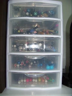
        Organizing Your Pens

        If you're like me, you have a lot of pens and it can be a challenge to keep track of them.  This set of drawers is one of the things I use to help coral all my loose ones (the ones that aren't in a set that has its own container).  There are five drawers in this little unit.  The top one holds my metallic pens and the next one down holds pencils. The third drawer has a variety of black pens, while the next one has blue and red ones.  The final drawer holds pens of colors that don't fit into the other categories.

        Monday, April 4, 2011

        Fading Photos

        If you print your photos yourself, you can play with them using different techniques in your photo editing software.  I wanted to see what it would look like to "fade" the edges of my photo.  But how would I cut it out that way?????  I decided to layer the photo over a background and fade it that way.  Then I could just print the background with the faded photo and not have to cut the photo out!

        Of course, that wasn't the end of the challenge.  This was before I bought my wide-body printer, so the largest I could print was 8 1/2" x 11" - and I was making a 12 x 12 page!  As you can see, I managed that little challenge by using coordinating brown cardstock for the bottom part of the page, with a couple of strips of brown running from it to the top of the page.  I then cut my 8 1/2 x 11 so that it would space properly behind the brown cardstock.  Now it looks like I printed my picture 12 inches wide - even though I didn't!  The white letters set the title off nicely and help tie in the the white in the journaling block and the thin mats on the smaller photos.

        Try this fade technique to create a focal for your cards.  No problem with having a regular sized printer there!

        Sunday, April 3, 2011

        Scrapbooking Challenges - Part 1

        Today we start a new scrapbooking series that will be posted on the next several Sundays.  It will cover a variety of challenges that can come up when one is scrapbooking, and ideas for handling them.  Take a look at the scrapbook page above and see if you can spot what was wrong and how I tried to camouflage it.

        In this case, I was dealing with an heirloom photo that had the lower left corner torn off of it. This presented two problems. First, was the simple issue of mounting the photo.  Since it was an heirloom, I did NOT want to use adhesive of any kind directly on it, but the missing corner made it difficult to simply use the transparent corner mounts I often used.  Second, I wanted to draw attention to the picture, not the damage it had sustained.

        As you can see, I started with a mat with scalloped edges.  This helped draw attention to the photo itself.  When the eye starts to move to the edge of the photo, it is drawn to the scalloped mat and away from the damaged corner.

        Next, I made some over-sized photo corners from the same cardstock as the mat (so undo attention wouldn't be drawn to them) and used them to hold the photo on three corners. The larger size helped give the stability needed to hold the photo in place with just three corners.  I then glued a forth oversize corner where the 4th one would naturally be.  Though the corner doesn't completely hide the damage (because going too large with the corners would have hidden too much of the information on the bottom of the photo), it DOES help make the missing piece less noticeable.

        Finally, I added pen work around the scalloped mat, and the scalloped edges of the photo corners.  Notice how, when you DO look at the damaged photo corner, the pen work draws your eye away.

        3 tricks that you may find handy some time.

        Saturday, April 2, 2011

        A little baby set


        Today I thought I'd share some pictures of a little outfit I knit for a grad-niece who is on the way.  I got the pattern from McCall's Needlework & Crafts - I think it was from 1971.  Here are some closeups:

        Friday, April 1, 2011

        Using Your Scrapbook Papers for Card Focals

        When needing for a quick and easy card, try cutting out a portion of your scrapbook paper as a card focal!  The focals on both this card and the one to follow come from Paper Pizazz books from Hot Off the Press.  This first one comes from the book "Janie Dawson's Sweet Companions".  In this book, most of the 8 1/2 x 11" papers come in sets of two.  One page has a picture and saying in the corner. The second page is a coordinating pattern.  Here you can see I cut out the picture and saying to use as my focal.  I used some of the remaining paper for the background - the ribbon-like strip across the bottom was printed on the paper already.  I cut out the little sun to serve as an accent.  A bit of plain turquoise paper for mats and a decorative strip on the side and I had a quick and easy card ready to go.

        The focal on this card came from the book "The Cat's Meow".  It's done in a similar way to the previous book -- one page has a picture in the corner, the second page has coordinating paper.  I used the picture in the corner for my focal, cutting it out in such a way that some of the paper shows for a border. I then matted that on plain blue paper.  The punch used on the white sides is the "Doily" one from Martha Stewart.  It's one of my all-time favorite punches.  It gives such a lacy effect.  You can't tell from the picture, but the "Happy Birthday" is foiled in a shiny blue.  Looks really good in person.