After applying gesso to protect the page, this picture was loosely traced from a smaller picture using a light box and Inktense pencils (water color pencil for the hands since I don't have that color in my Inktense pencils). As usual, the next step was drawing the color out with a water brush. After letting it dry, I went back and added more shading by lightly coloring with the pencil in shaded areas and once again blending with the water brush. This was done 2 or three times in order to get the shading I have. Finally, I added lettering with my Pitt pens, using yellow Inktense to color in the word "GOD".
Please let me hear from you!
and Stampin' Up! products in particular -
so much so, that I became an independent Stampin' Up!®™ demonstrator earlier this year!
Full disclosure: I get a small commission on purchases made using Stampin' Up! links from this website - but this in no way affects your price. It just serves to help support my blogs. Thank you in advance for that support!
As of January 21, 2026, most of my Stampin' Up! makes are moving to
https://cheringloveofpaper.blogspot.com/.
Most of my makes will be using Stampin' Up! products and be on that blog,
but any makes from other materials will still be posted here.
Enjoy browsing my blogs, and I'd love to hear from you.
It is what helps make the time I put into these blogs feel worthwhile, and always brightens my day.
NOTE: All Stampin' Up! Images © 1990–2026 Stampin’ Up!®
Wednesday, January 30, 2019
Wednesday, January 16, 2019
"C" swap
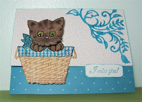
Today's card was made for a card swap. The focal had to start with "C" so I went with a CAT! The card front has the bottom cut away & tucked behind the "I miss you!" sentiment to hold it closed. The cat focal is just glued to the card front but extends beyond it.
FOCAL: The stamps & dies used for the cat, bow & basket were from a Stampendous set called "Pop Up Kitties". I just love them! The basket was stamped onto a linen-look printed card stock, the basket cover on a scrap of patterned paper (old one from HOTP), the bow on a holographic cardstock (HOTP), and the cat on a dark brown printed card stock. I added color to the cat using chalks and smooch ink for the cat's eyes & nose before attaching the head with a wobble spring.
The sentiment came from a North Coast Creations stamp set called Floral Sentiments 8. It was stamped on white paper, the corners rounded, and the edges inked. I attached it to the card with foam tape on the lower edge, aligned so it would catch the edge of the card.
The corner treatment was cut from a mulberry paper using a Spellbinders die from the "Botanical Swirls and Accents" set. I cut away the triangle frame so I would have a more organic vine look.
After I took the picture, I decided it would look better if I rounded all the corners - so I did! :)
Sunday, January 6, 2019
Another Dual Content Page
This page is a split content with the top picture relating the the verse highlighted in blue and the bottom one relating to the yellow highlighted verse. Both, however, were done basically the same way.
1) Protect the page with clear gesso.
2) Draw/trace the outline of the image with Inktense pencils (and watercolor pencil for the flesh color). Blend with waterbrush.
3) Add background color. This time I used Distress Oxide ink on craft sheet & add carefully with watercolor brush blending from the outside to make it lighter around the image. This was my first time using distress oxides in my bible, but I like they opaque nature of them & the way they blend. However, I was a bit concerned when they seemed to want to continue to come off on my hands if I touched anything - even after trying to heat set it a bit with my Ranger heat tool. I believe this is what caused the issue with the brown marker (see #4 below)
4) Add words with Pitt pens. NOTE: For the bottom picture, I first wrote the words with a very fine-line water based brown marker - but came back later to see that it had bled into the inked background. SO, I went over the words with a fine Pitt pen at a later date.
5) Add some washi tape to create a border between the two pictures.
I was really glad to see that though the distress oxide ink didn't initially seem to want to set & caused the brown ink to bleed a bit, after I set the page aside for several days, the ink was completely set and is causing no issues. It just seems to take much longer to dry/set (at least over the gesso!) than other mediums I've used.
I was really glad to see that though the distress oxide ink didn't initially seem to want to set & caused the brown ink to bleed a bit, after I set the page aside for several days, the ink was completely set and is causing no issues. It just seems to take much longer to dry/set (at least over the gesso!) than other mediums I've used.


