Monday, May 30, 2011
Flower Soft Part 4 - Leaves
Sunday, May 29, 2011
Scrapbooking Challenges Part 9 - Lots of different sized little pictures

As you can see, I started with a mat in which I had cut 8 circles. I then used photo corners backwards on the BACK of the mat to add the pictures behind the circles. The forms a large frame for the pictures that helps them all look uniform and helps them make a statement rather than getting lost on the page.
At the bottom of the page I wanted to use my corner adorner punch to create frames for the photos, but the original photos had been cut to slightly different sizes, and the corner adorner is designed to mat with a set size frame around the photo. So . . . after matting each one, I layered them on top of a strip of the same color paper (on which I wrote the names) with the tops of the pictures aligned. This helps to camouflage the slight differences in size.
Friday, May 27, 2011
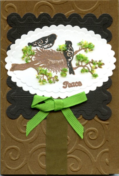
Purchased Focals


Thursday, May 26, 2011
Christmas in May!

Well, it's the last Thursday of the month, so I'll share another Christmas card. Here the traditional green and red are "blued" a bit to give us the aqua and purple of this card.
- The gingerbread man focal was made using a "Snag'em" stamp from imaginisce. It was stamped onto tan paper and then accented with a marker.
- The papers are from Hot Off the Press.
- The borders are all from the peel-off border sticker sheet. The border itself lines the largest mat. The purple one is bordered with the "innies" from that border (the little tear-drop shapes from the inside of the border - left behind when it was removed). Then the border right around the gingerbread man is from in-between the border strips.
- The greeting is another outline sticker.
Wednesday, May 25, 2011
More with Scratch Magic

My last example is using something from the transparent sheet and the glittery sheet together:


Tuesday, May 24, 2011
Fun Scraps for Cardmaking

Monday, May 23, 2011
Flower Soft Part 3 - Animals


Sunday, May 22, 2011
Scrapbooking Challenges Part 8 - Skewed Picture.

When I started working with this particular scrapbook page, I wanted to include this photo. But the horizon line slanted so badly in the photo that it looked pretty ridiculous to put it in as it was. If I cropped the picture so the horizon was straight and the photo was still rectangular, I lost too much of the view. Then I realized I could crop it so it looked diamond shaped with the top & bottom of the "diamond" cut off. This would retain the bulk of what I wanted to see in the photo and allow me to make the horizon look straight! Here's what I ended up with:

Saturday, May 21, 2011
Scratch Magic Inspiration

Inspiration can come from unexpected places. This card came out of an activity packet received at Christmas time called "Scratch Magic". It contained several sheets of special media covered in either black or white "stuff" that is scratched away to reveal colors below. At first I just play with the plain stencils that come in the packet. Then I realize that using my more detailed stencils might create something interesting. I give it a try, and this focal was born, making for a quick card.
The packet also contains a similar piece of material that is translucent. From that, I get THIS card.

It looks a bit dark when the card is closed, but when it is opened, the light shines through and it looks a bit like a stained glass window. So, this little packet that I thought was just an "activity" kit, turns into something fun for making cards.
Friday, May 20, 2011
Print Your Own Focal

- Background paper from Indian Summer Fall Matstack (DCWV) - glue it to blank card front and then trim to fit.
- Two strips of black cardstock - a thinner one and a wider one, attached as shown with a gluestick.
- Print and cut out the beaver and glue him to the card as shown.
- Stamp the greeting with black ink (I used black StazOn as some of my other inks washed out a bit on this paper. The stamp was a clear acrylic stamp from a little Father's Day set from studio g.
Thursday, May 19, 2011
Anniversary Card

Monday, May 16, 2011
Flower Soft Part 2 - Grass

As I mentioned, for a few weeks on Mondays we are looking at examples of using Flower Soft. Today's image is a digi-stamp - probably from Angelique's blog, though I'm not certain. Here we have an example of using Flower Soft (Meadow) to make grass. Compare it to the simple colored grass below and see what a difference it makes. All it took was a few dabs of Flower Soft glue and a sprinkling of Flower Soft!

Sunday, May 15, 2011
Scrapbooking Challenges Part 7 - Too Little!

However, I didn't do all that I could have on this page. I suspect that if the journaling had been on white (or cream - whatever the main color of the patterned paper is) rather than yellow, more attention would have gone to the photo. Also, if I had made the oval frame bigger, it would probably have made the picture feel larger. So, I guess you can say this page demonstrates "progress, not perfection."
Friday, May 13, 2011
Picture Perfect Focal

Today's card demonstrates another possibility for card focals. Use pictures you have taken! This can make for a quick and easy card. Here's how I did it:
- Started with a blank purple swirl card from Hot Off the Press
- I cut a couple of purple strips for borders, one thin, one wider - each cut to the width of the card. I cut another out of lighter purple a bit thinner than the wide one and using a deckle-edge cutter. I glued this to the center of the wider border.
- I then wrapped 1/8" purple satin ribbon around the wide border - at both top and bottom as shown, fixing it with tape in the back. I added the purple ribbon in the center of the narrow border in the same way.
- I cut the picture so there was a thin white border around it, then mounted it on a white cardstock rectangle, which was then mounted on a purple one. I added a purple ribbon near the bottom of this, adhering in the back with tape as before.
- Now all I had to do was glue the pieces to the card as shown in the picture, and then write my greetings with a purple pen (I used a Sakura glaze pen).
Thursday, May 12, 2011
Birthday Card


I also need to confess that the original papier tole came with a picture of a bee on it. A bee for me can have connotations of stinging people and I didn't want that message as a part of my card, so I cut the bee out! The inside picture is the only one where it really made much of a difference, so I took the cut piece with the bee and moved it under the rest so that the bee was hidden, but a portion of the leaf still showed in part of the space where the bee had been, helping the design look better.
The thin border on the front of the card (bottom & around the window) was cut from the scraps of the papier tole sheet. The sentiment was a silver outline sticker which I colored with alcohol ink to match the borders.
Monday, May 9, 2011
Flower Soft - Part 1

- Assemble basic notepad cover.
- Print digi-stamp and trim it to a rectangle.
- Color in the digi-stamp with markers (I used Marvy Markers).
- Add dots of flower soft glue and add flower soft - let dry.
- Ink the edges of the rectangle.
- Using one of the nestabilities dies and the Big Shot (or similar machine), cut and emboss the small scalloped oval to frame the greeting.
- Stamp the greeting with a clear stamp from a Christmas set of stamps from Paper Wishes.
- Draw around embossing with a pen to add to the frame.
- Glue it all in place & you're done!

Sunday, May 8, 2011
Scrapbooking Challenges Part 6 - Too BUSY!

Friday, May 6, 2011
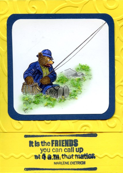
Words as Focal

Thursday, May 5, 2011
Mother's Day

Mother's Day is just around the corner. This one is made with Papier Tole from Hot Off the Press, for a stunning focal with a metallic shine. The different pieces are given added dimension with the use of foam tape. The sentiment is an outline sticker, and the silver outlining is all done with thin outline border stickers.
Sunday, May 1, 2011
Scrapbooking Challenges Part 5 - Too Yellow!

Subscribe to:
Posts (Atom)